Over-Illustration?

King Lear by John Boydell

In 1884 the literary journal North American Review published a screed simply titled, Over-Illustration by Charles Tabor Congdon, a New York journalist. To read it is be brushed back by a swinging fist. Perhaps it should read by all illustrators as a provocation.

The essay offers criticism, or better yet, an attack – on the then growth of elaborately illustrated books and periodicals – presumably for adults and specifically fiction. In the late 19th Century, newly developed printing methods were facilitating an explosion of illustration and a became showcase for artists like Winslow Homer, Thomas Nast, Kate Greenaway, Howard Pyle, Gustave Doré and A.B. Frost, to name a few. What’s not to like? Plenty, according to Congdon. He names names and is not afraid to be harsh. He takes a big swipe at the illustrations of Shakespeare by John Boydell (shown below). He punches at William Hogarth and Doré as well. To me, those were irrefutable masters of the genre.

Below are a few quotes which spoke to me. Maybe you’ll get your ire up from others from the full essay. I welcome the attack as it provokes me to defend illustration. The genre will always feature positive and negative elements, and it’s instructive to to occasionally reassess its function.

Romeo & Juliet by John Boydell

The ordinary purpose of an illustration is to explain, to elucidate, to render clear what is obscure or abstruse; and this is doubtless the secondary object of the pictorial embellishment of works of literary character. Used in this way, it differs from pictures designed to enhance the sumptuousness of a volume, and to increase its typographical elegance and bibliographical value, which now appears to be the primary intention.

A picture might be made from Shakespeare’s description of the Cliff of Dover, but no picture could add to the sense that he awakens of its loftiness. 

Not (William JMW) Turner himself could have added anything from his palette to the exquisite opening of the Fifth Book of “Paradise Lost…”

Most illustration has the demerits of miniature painting without its merits. 

It is a remarkable fact that no painter has ever won enduring fame by working from writers, if we except the Bible, which is so much more than any book.  

Charles Tabor Congdon

Half of illustration is impertinent. It is a suggestion from somebody who is perhaps less fitted than the reader to judge of what he shall admire the most. It is like the irritating comments that stupid folk scribble upon the margins of the novels. “Is not Jane lovely?” “Beautiful!” “How brave Charles is!” 

A scene, an action, an event vividly described by a writer, ought of itself to make a picture in the mind of the reader, and each ought to make his own. They might differ in details, but these are of no importance if only the general spirit of the text be observed. But here the illustrator steps in and makes originality of impression impossible. He takes the work out of the hands of the writer, and dictates to the reader what he will see. No wonder they’re that writers are often ill-content with the illustration that has been vouchsafed for them. The picture can only be one man’s notion of what has been described. It is not a translation: it is not even a paraphrase; it is simply a commentary, wise or unwise, which, even if one had been needed, has not supplied the need: and any literature stamped with such characteristics can only enfeeble the mind and pervert the judgement and diminish the ability to read to any purpose. 

We understand perfectly well the innocent pleasure that cheap pictures give: but we understand, also, the the indulgence in this taste may be carried too far and may work harm both to the illustrator and the illustrated. We are living in a time remarkable for a want of great writers in several departments of literature, and it may be questioned whether this unpleasant state of things may not be attributed, in part, at least, to the intellectual indolence that a habit of indulgence in mere picture-gazing may have originated and confirmed. 

Artists Who Illustrated: J.M.W. Turner

D27661_10.jpg

Perugia, 1826-7

16.jpg

The celebrated English artist, J. M. William Turner (1775-1851) was not only painter; he was also an illustrator. He created images for a number of books of poetry and literature by such writers as Lord Byron, Sir Walter Scott, and John Milton. Most successful perhaps, were his books by Samuel Rogers, which drew on his sketching practice and travel experience.

The esteemed art critic John Ruskin (1819-1900) received one those books, Italy (1830) for his thirteenth birthday and later wrote, “There can be little doubt that the illustrations to Italy and the Poems first made Turner known to the vast multitudes of the English people. One of the most vivid recollections of my own boyhood is the wakening up of a new sense of an ideal world of beauty as I lingered over the lovely landscapes on these delightful pages … there are many whose recollections of these two volumes harmonize with mine, to whom they were an education, and who learned from them to admire Turner before they had actually seen one of his paintings”

17.jpg

While Turner’s illustrations were created with paint and pencil, they were all translated into engravings by other artists, as needed for publication back then. Turner was known for working closely with the engravers, asking for multiple proofs before approving. Turner knew what illustrators know: that the printed piece was the finished piece – the public saw the book, not his watercolors. Both Turner and the engraver of each image signed the illustrations.

D27677_10.jpg

Rome (Castle of St. Angelo)

All the illustrations were designed as vignettes  –  irregularly shaped art without hard borders, which was popular in that booming era of illustrated books. Vignettes, like letters, interact with the white of the page.

The author of The Engraved Work of JMW Turner, R.A. (1908), W.G. Rawlinson described Turner’s illustrations this way:

“Of all the artists who ever lived I think it is Turner who treated the vignette most exquisitely, and if it were necessary to find some particular reason for this, I would say that it may have been because there was nothing harsh or rigid in his genius, that forms and colours melted into each other tenderly in his dream world, and that his sense of gradation was the most delicate ever possessed by man. If you examine a vignette by Turner round its edges, if you can call them edges, you will perceive how exquisitely the objects come out of nothingness into being, and how cautiously, as a general rule, he will avoid anything like too much materialism in his treatment of them until he gets well towards the centre … Turner’s [vignettes] never seem to be shaped or put on the paper at all, but we feel as if a portion of the beautiful white surface had in some wonderful way begun to glow with the light of genius.” -from the Tate.org 

800px-Portrait_of_J._M._W._Turner,_R.A._making_his_sketch_for_the_celebrated_picture_of_Mercury_&_Argus_(4674619).jpg

Portrat by Charles Turner, 1840

D27675_10.jpg

The Forum, 1826-7

D27620_9.jpg

Study for The Forum, 1826-7

D27664_10.jpg

St. Maurice, 1826-7

D27518_10.jpg

Study for St. Maurice, 1826-7

D27662_10.jpg

Aosta, 1826-7

D27676_10.jpg

A Villa (Villa Madama – Moonlight), 1826-7

D27667_10.jpg

Lake Como, 1826-7

Book Look: Drawing on the Spot

cover.jpg

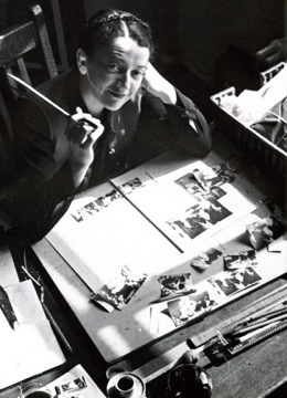
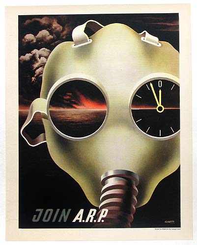
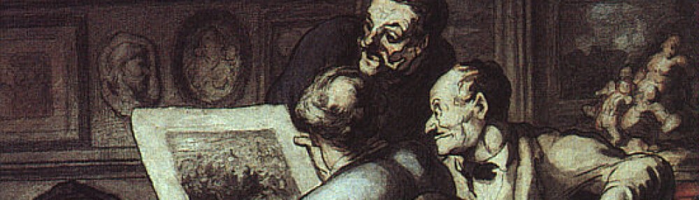
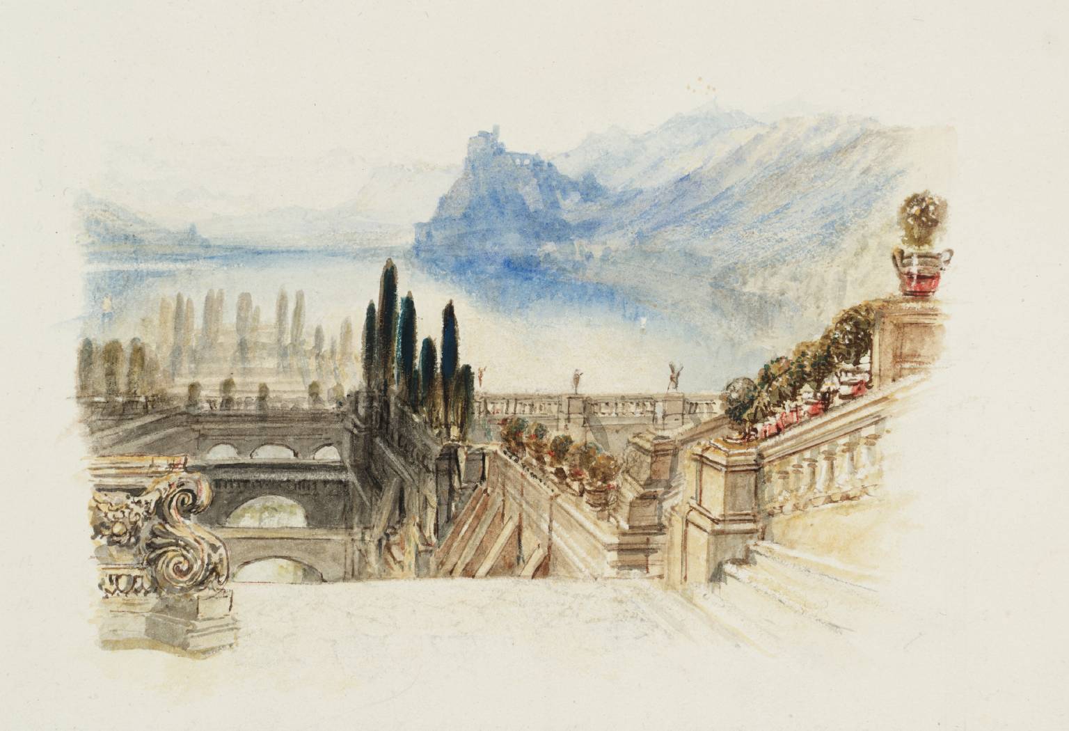
Drawing On the Spot: Twelve Illustrators Describe Their Materials and Working Methods on Location by  Nick Meglin was published in 1969, and that was a time when a number of prominent illustrators were regularly commissioned to do visual reportage for magazines. Looking at the list of artists interviewed in the book, we see some very important and influential artists. Back then, magazines like Fortune would feature lots of illustration – much of it created from on-site investigation and creation. Sports Illustrated was, well, illustrated, art least partially. And publications such as Holiday and Look which no longer exist, sent illustrators on assignment as correspondents as well. And they were not the only ones.

Nowadays, we’re seeing a resurgence of illustrators working on location, although the assignments are still quite slim. It’s interesting to see how many great young illustrators of reportage there are in England right now. But in the US, there are only a few who have a busy reportage practice.

What we do know is that the internet has fostered the huge growth in the popularity of sketching on location and charing the work online. Artists and designers are acting as correspondents of their own lives. Urban Sketchers (which I’m affiliated with) is approaching its 10th anniversary, and it has fanned the flames of enthusiasm.

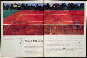
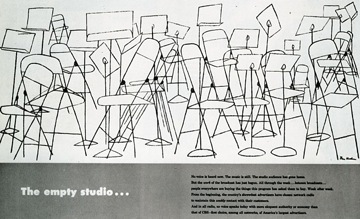
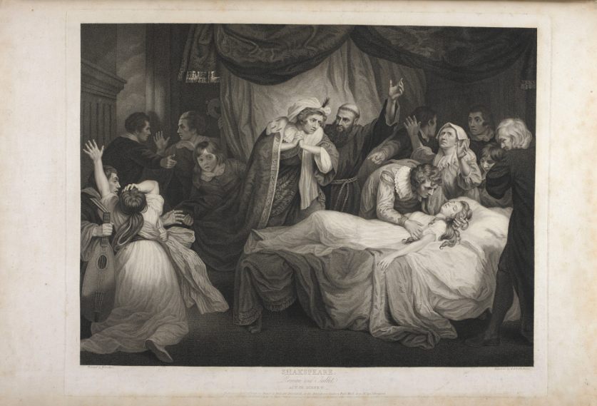
So perhaps it’s a good time to revisit Drawing On the Spot. In the first of what I hope to be a series of book reports, I cull the book for some nuggets of wisdom from a number of artists who worked “outside the box” – their studios that is,  to  create great works as both artists and correspondents. What follows are highlights from the chapters on each artist and a reproduction of their work from the book or the internet.

Tom Allen

plate1_r1_c1.jpg  Tom Allen.jpg

“The only sacrosanct rule of art for me is personal involvement. All other rules can be – and have been- successfully broken. An artist must be intensely involved with his subject in order to give it his particular insights and convictions – his point of view.”

 “Without total involvement there would be no art, only pictures.”

 “There may be several aspects of a scene that stimulate my interest. Sometimes the stimulating factor is the mood, or an emotional response, or sometimes it’s the the activity in a scene. More often it’s the elements of design in a scene that stimulates me. I look for shapes and compositions formed either by things and people, or by light and dark.”
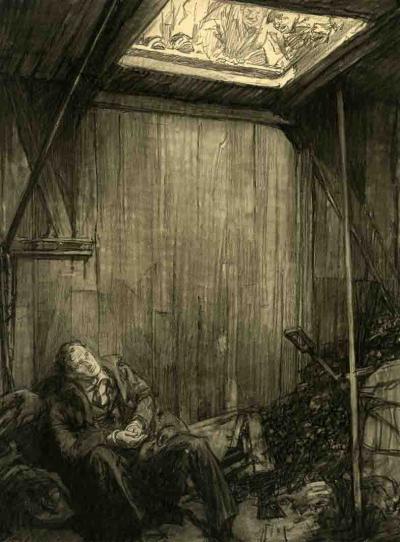
 

Alan Cobercober.jpg  483533-015.jpg   alan-cober-drawing-sitting-at-the-arch.jpg

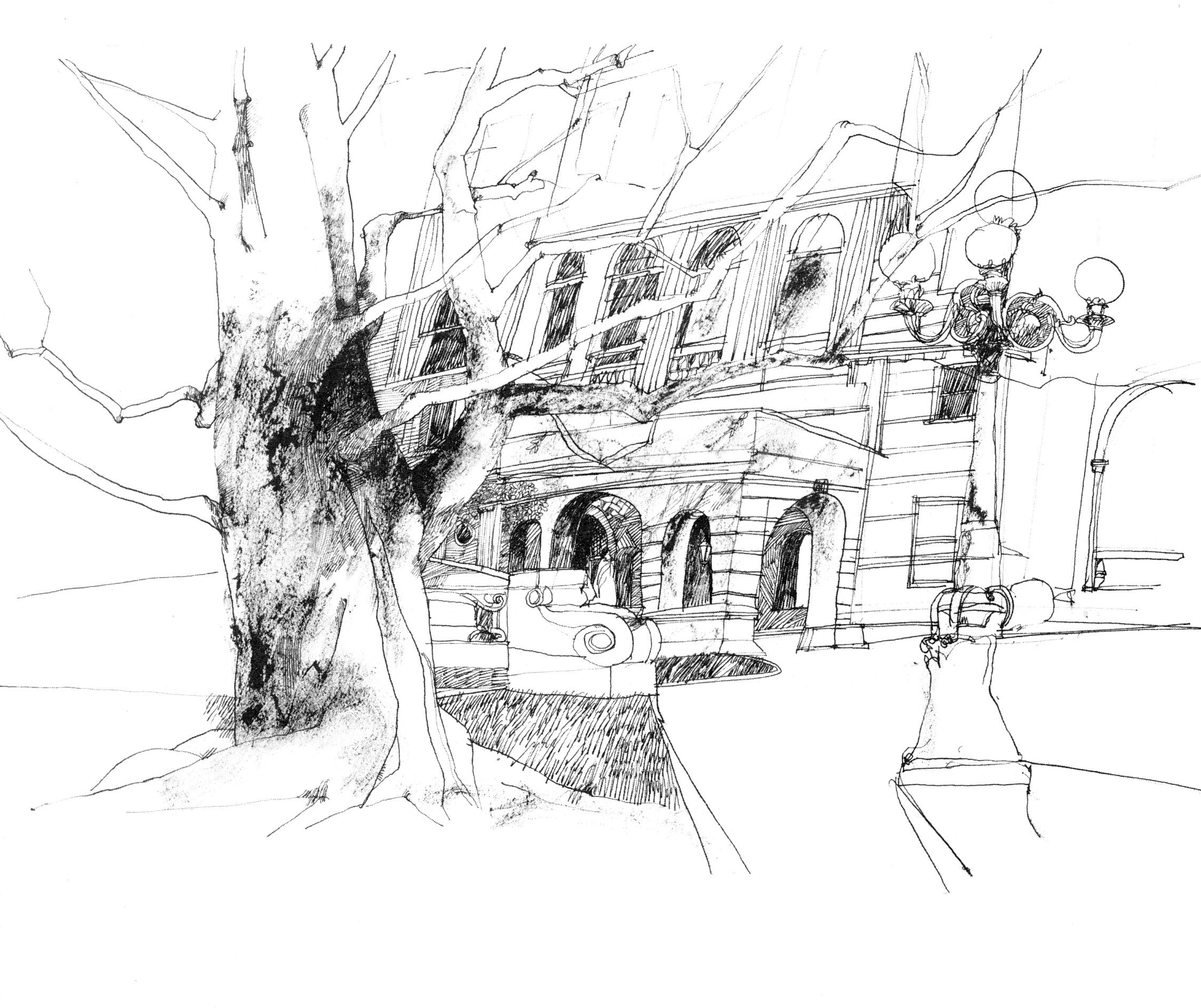
“A drawing should have a life of its own”
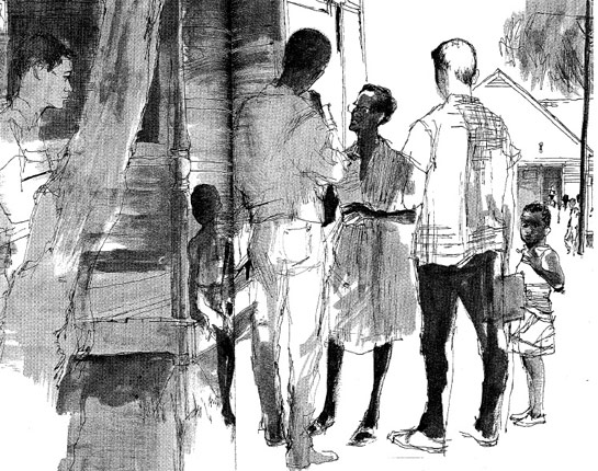
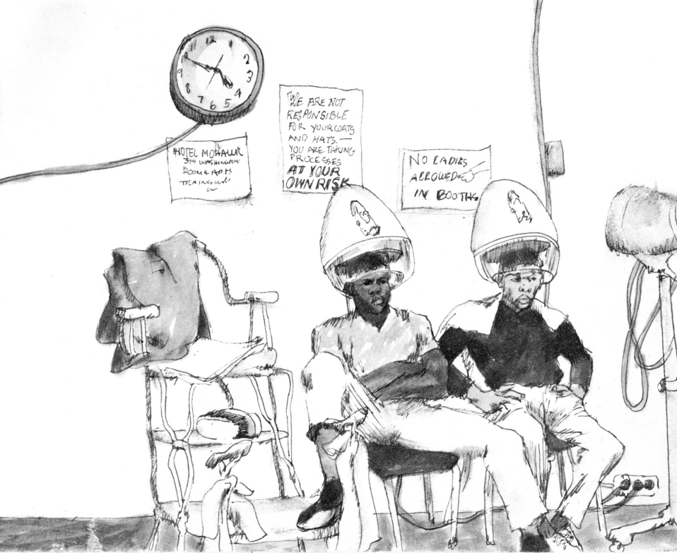
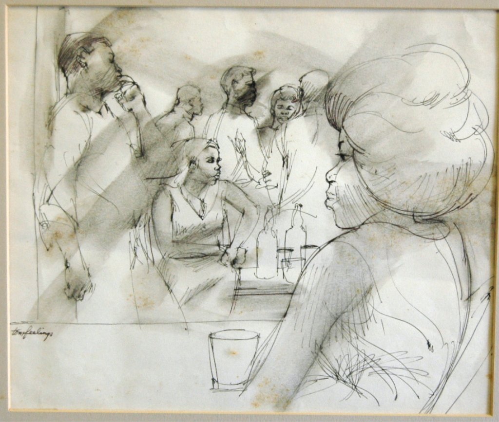
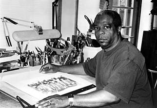
 

Tom Feelings

 tom feelings.jpg   15170620_2_x.jpg  tomfeelingsphoto.jpg

“For me, it’s not art for art’s sake, it’s art for my sake.”

 “It’s important for an artist to depict the things he feels strongly. Growing up in a black community in Brooklyn and yet not seeing enough drawings and paintings that say enough about the people and places right outside my door – the things I see and feel every day – convinced me of the need to portray this contemporary scene. I deeply feel that this direction is extremely important for the black artist, for his own development and search for originality.”

 “If you’ve never felt insignificant, you don’t have to search for your significance as I did. I returned to the United States (from working in Africa) with the need to express myself as a man through my art.”


Robert Frankenberg

frank....jpgfrankenberg.jpg

“There is a difference between looking and observing.” 


John Gundelfinger

00-1.jpg 0cb8264f2b2490ea14b0e5809fc39e85.jpg
Gundelfinger.jpg  28899_John_Andre_Gundelfinger_bio.jpg

“There’s no such thing as “interesting subject matter,” what’s interesting about any subject is what you as an artist do with it. There have been interesting drawings made of what might be described as uninteresting subject matter” just as there have been flops with subjects which beg to be drawn. The fault is not with the subject but with the artist.”

“Although I believe there’s a drawing everywhere, I don’t draw everything I see. I draw only that which moves or interests me at the time. The reasons for being stimulated perhaps can be explained psychologically later on, but it’s of little concern to me. I don’t question an inspirational moment; I succumb to it. THe more you observe and draw, the more possibilities arise even from areas that most would consider dull (consider Van Gogh’s chairs, for example). The point is to draw first and ask questions later, for if the process is reversed, they’ll be too much thinking and theorizing being done and not enough drawing.”

John Gundelfinger’s drawing seem like “natural,” as if the picture were there and all he had to do was in front of him. But this can never be the case. You have to see a picture first, and the seeing is done with an educated, sensitive eye, not a lucky one.

“I never know what a drawing will look like until it’s finished. Once you do – that’s security: and security is something we can all do without in drawing.  It comes from working in a particular way or style that enables you to control any subject or situation you encounter, and once you’re in control you stop learning. The nervousness and anxiety that precede a drawing are important to the end result, and certainly more of an asset to it than mannerism can ever me.

“I can learn more from my mistakes than from a drawing where everything fell into place easily.”

 “It would be of little use to try to copy or imitate a good line, shading technique, or composition. Repeating a past success is no real accomplishment.”

 “A finished on-the-spot drawing is a fortunate experience and should always be thought of as such. It shouldn’t be the reason you go out, for the objective is “drawing” and not “the drawing”.”

 “That old cliché that “art is 10% inspiration and 90% perspiration has, like most clichés, a solid foundation. There is just no substitute for hard work…”
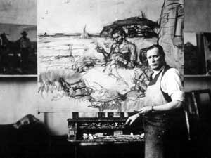
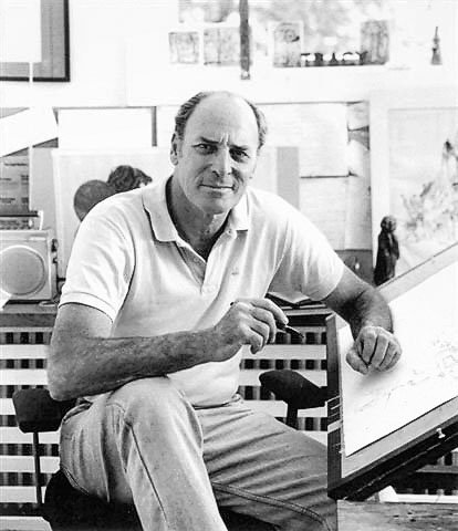
 

Franklin McMahon

obitArtist.jpg
Ihobama2.jpg

“Most of my (reportage) work is self-assigned. I go out with an idea or premise, draw it, then submit the drawings and captions to publishers who might be interested in the story.”

On-the-spot drawing enables a type of picture coverage not ordinarily employed by photographic reportage. The cameras click “during” – seldom before or after the “decisive moment.”

“Too many artists are more concerned with the drawing process than what the drawing is all about. Materials take care of themselves if you use them simply as tools for carrying out your concepts. Once you start thinking about them you lose some of the intensity is a lot more important to the drawing than a trick line or shadow.”

McMahon isn’t searching as he draws, he’s stating.

“I don’t seek out the merely “picturesque” because everything has a way of paying off as you begin to set it down on paper.”

 “On-the-spot drawing allows you to take a kind of cubist approach to the subject to the subject, drawing it from several angles in the same drawing, and drawing it as you “know” it to be rather through someone else’s angle of vision or emotional point of view, which is why I prefer not to use (other’s) photographs.”

 “But most of all I believe the drawing, not just sketches or rough notations, but early commitment to the actual drawing, should take place on-the-spot. That gives artist, pencil, and subject a chance to interact.” 


Nick Meglin

meglin.jpg meg1.jpg   meg.jpg

“I try to draw laughing eyes, not hazel eyes; or if the subject is asleep, I try to draw sleep rather than closed lids. There is a difference, and my interest is in capturing that difference.”

“Many who distort do so because they have no alternative. Distortion, then, becomes a blanket to hide the artist’s inability to produce an honest, accurate study beneath.”

 “Good draftsmanship is not of an age or a “school’. It can never be dated. There always has been and will be, a place for it in the art world. What do become dated are thought processes and boundaries set up by tastes, opinions, styles, techniques, and the “acceptable” art of a particular era.”


Bill Negron

negron.jpg

Whatever “catches” him at that instant becomes the point of emphasis.

The name of the game is selectivity. Not an intellectual selectivity, but an emotional one that responds to the moment; it cannot be anticipated nor can the effect be predetermined.

“It doesn’t make much sense to draw everything the eye can see. The greatest advantage an artist has over the camera is the ability to pick and choose. He can include or omit things at will, accenting that thing over there or fading out that street light over here. This ability to pick and choose, when combined with similar features that a camera is capable of, such as taking in a scene with a wide-angle view or coming in on something with a telescopic view, gives the artist great latitude. He can bring into focus only that which interests him.”
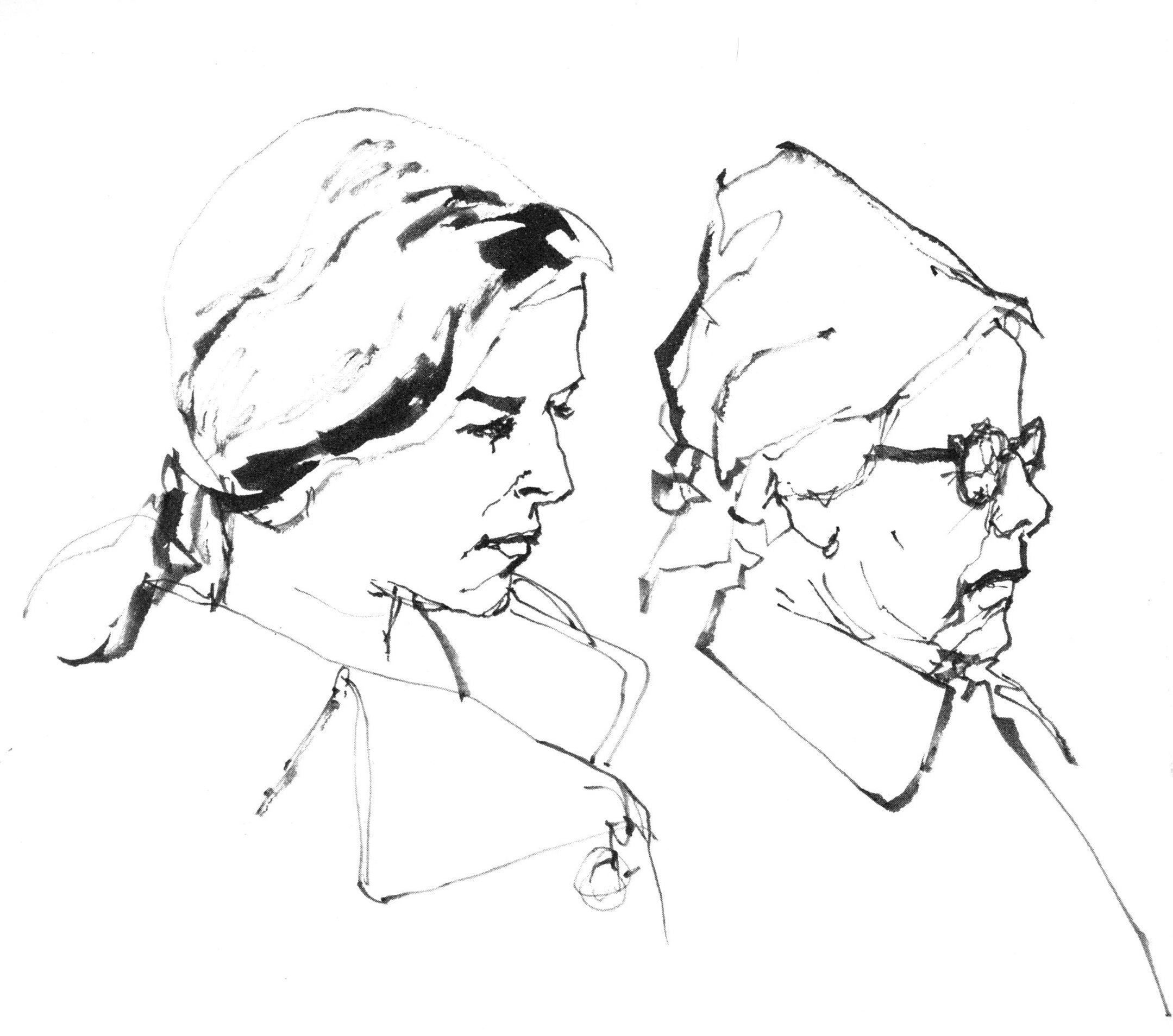
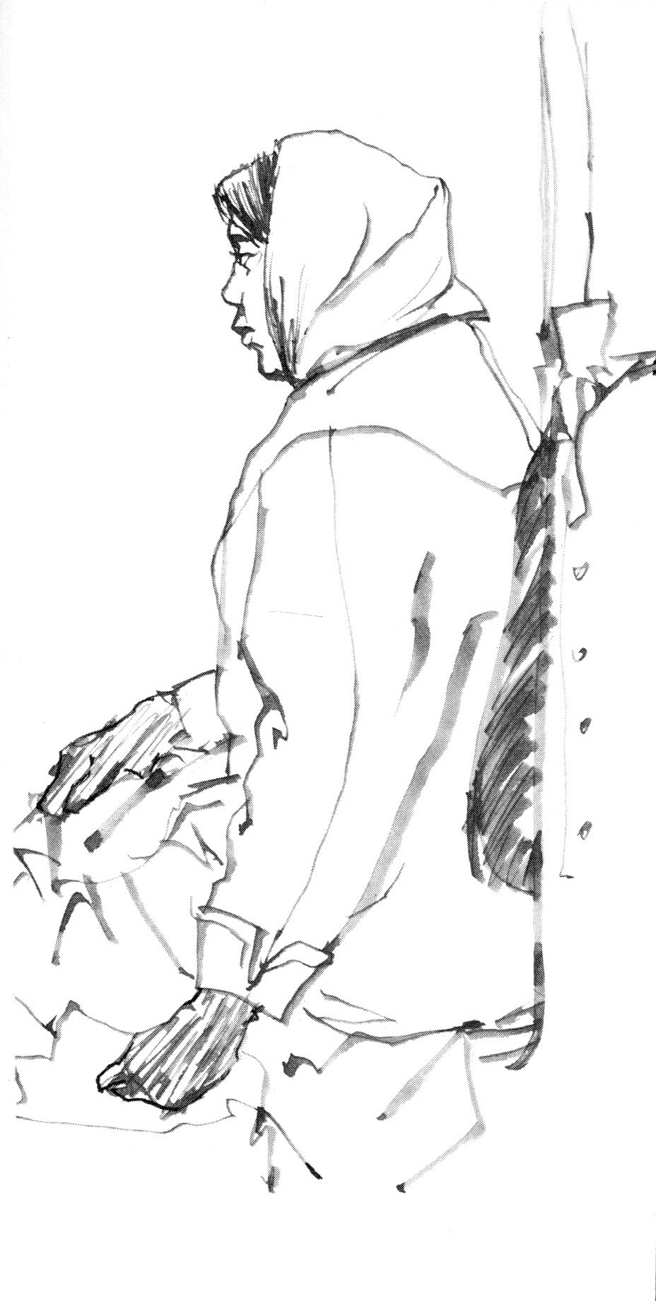
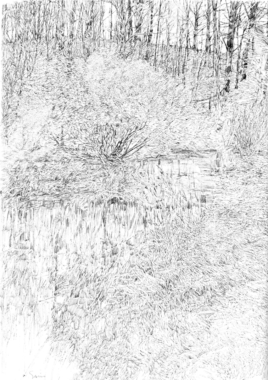
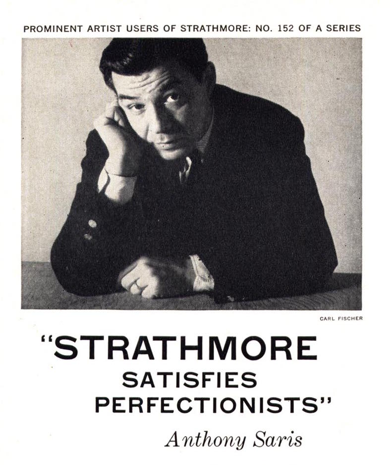
Anthony Saris

saris.jpg   4117709561_53a0e06b74_o.jpg
4117840414_6fe7ef3dff_o.jpg

“A sketch…is much more fragmentary than a drawing, It’s a preliminary notation, often serving no purpose other than that of jotting down an impression. The pages of an artist’s sketchbook make up a graphic diary of personal thoughts, ideas, and observations; each sketch is a study, a learning process, an unfinished experiment with no predetermined use.”

“When I sketch, I’m not concerned with making personal statements or with producing a finished piece of work. I’m free of constraint and of the external pressure of deadlines, research, etc., which of course, make work especially pleasurable and relaxing.” 

His motivation for drawing is far removed from his motivation for sketching, yet both are executed with the same sensitivity and with the same dedication to accuracy.

An important advantage of the objective approach is the learning which takes place.

“With on-the-spot drawing the artist encounters unpredictable situations. Once he becomes stimulated by what he sees, he’s forces to create what he feels despite his materials.”
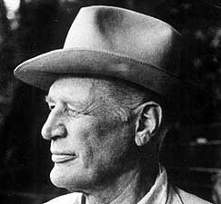
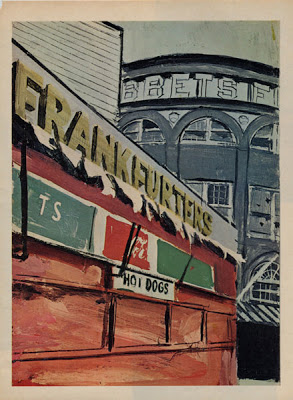
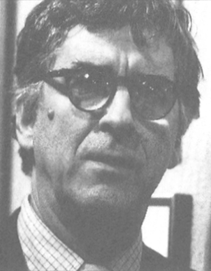
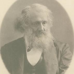
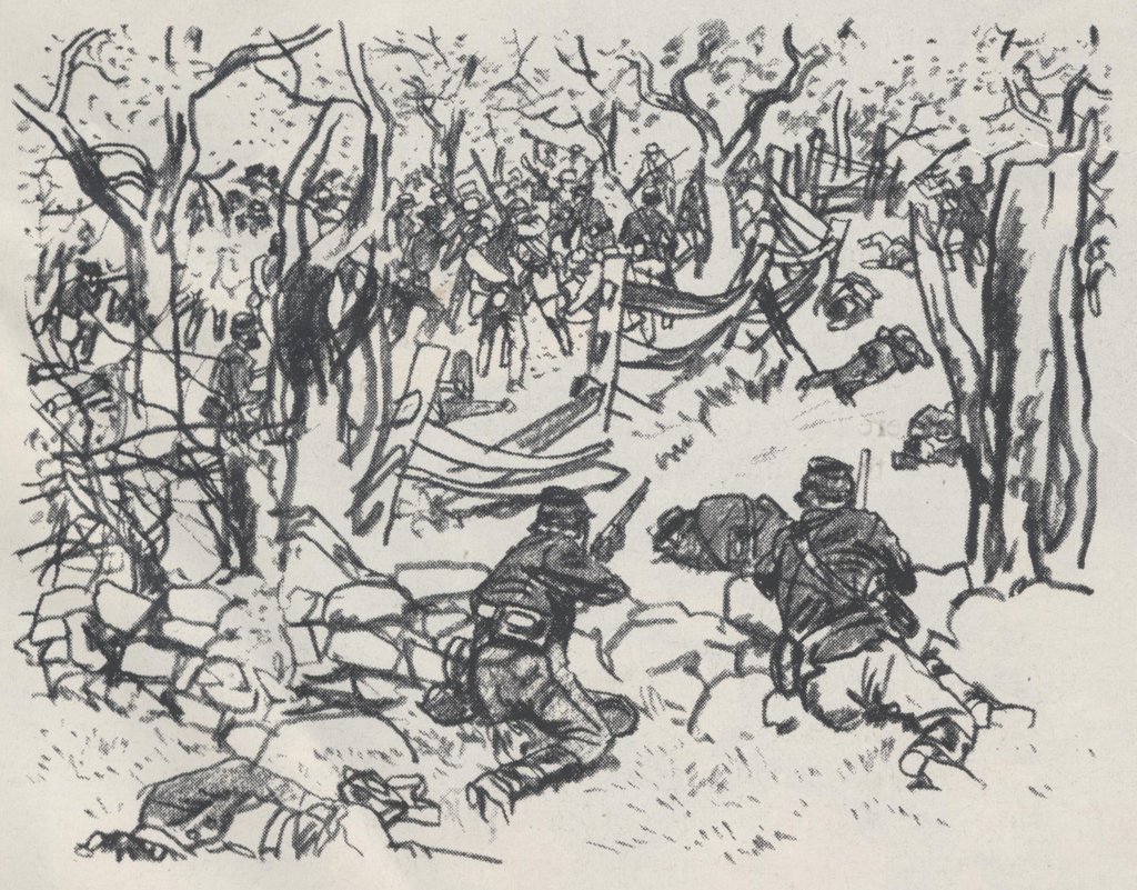
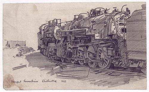
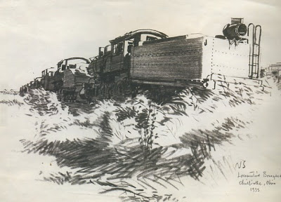
Noel Sickles

Sickles2.jpg   Noel Sickles.jpg80277190_16d9cf955f_z.jpg    sickles081.jpg

 “They (reportorial and landscape artists) share a common goal – to tell the story. But hasn’t that always been the role of the artist? What is the objective of “objective art” if not to tell the story?”

“My approach to drawing has always been to communicate. That’s my chief concern. I will reduce things to basics or arrange them in a particular way, anything that will enable me to achieve the goal. An artist has the freedom to do this, his major advantage over the camera in the past and certainly in the present. Since I work rather representationally, I have to take into account all these factors. I enjoy the challenge of location drawing, and my responsibility to that challenge is to be there, on-the-spot, with all faculties alert. If the artists eyes are focused only through the camera lens he won’t be aware of what is taking place all around him, which is often of equal importance to that taking place directly in front of him.”

In the case of personal or scenic art, there are various approaches open to the preference or mood of the artist. In reportorial work, however, demands of factual representation and a high degree of identification present an altogether different list of essentials.

As Sickles puts it:
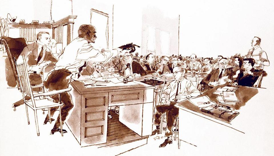
“For reportorial work, one needs a draftsman, an artist who goes beyond a literal rendering and who interprets and selects. He can often make the slightest sketch significant and can bring life, meaning, and vitality to a drawing as well as the imprint of a personal style. When I was asked to draw public figures at work in the NY State Senate in Albany, my sketches had to be just what was expected of me as an on-the-spot reporter – the Senate Hall had to look like the Senate Hall, and if a particular senator was up there on the dais addressing the assembly, then the drawings had damn well better show who that senator was. Any artist worth his salt doesn’t want to depend on a caption underneath to bail him out of a bad likeness.”

Tracy Sugarman

freedomsummer_galleryts_10.jpg  sugarman-author-photoszdjpg-cf7f75d81facd001.jpg
freedomsummer_galleryts_06.jpg  freedomsummer_galleryts_07.jpg

“To me, the most significant aspect of the on-the-spot drawing is the ability to get closer to man and the world he’s made.”

“You become more than an observer; you become part of the picture emotionally. You find yourself giving up assumptions, generalizations, and beliefs  once you’ve been exposed to real thing. It’s a learning process, one that never fails to alter preconceived ideas if you maintain an open mind.”

“Working in the studio may increase an artist’s knowledge of technique, but not of the world. When you’re on-the-spot, you meet people, you talk, you trade ideas and opinions. Hopefully, you grow. But most important you learn about yourself, sometimes more than you learn about your subject.”

“To me, bold committment is an emotional involvement with what you’re drawing rather than how you’re drawing it. You cannot be totally objective when you have the ability to pick and choose your subject. It stands to reason that a particular need from within precipitated your choice and your drawing is going to show it.”

“It is the emotional involvement that gives a drawing more significance than a photo of the same subject. Whether it registers in the viewer’s mind consciously or unconsciously doesn’t particularly matter – the result is the same. He’s aware that he is looking at an effort of someone with a special kind of talent who felt involved enough with what was happening to take the time and effort to record it in his own special way.”

“We’re also aware that in a minute’s time at least one photo can be taken. You needn’t have a thimble full of art knowledge to look at the average drawing and know that it could not have been executed in the same amount of time. This assumption can’t help but add to the significance that a drawing possesses.”

“To me the essence of successful reportage is capturing the fact and the meaning of a moment in time. For anyone who has found himself in the pressured position of struggling to fix that instant on paper when the situation is fugitive – sometimes hostile – it is an ideal only sometimes achieved. But it is in the attempt that I have found the joy of reportorial work.”

“If the moment is worth capturing, then the artist has the responsibility of endowing the drawing with the compassion that comes from understanding. It is in this fragile dimension the artist’s gift to the viewer is made.” 
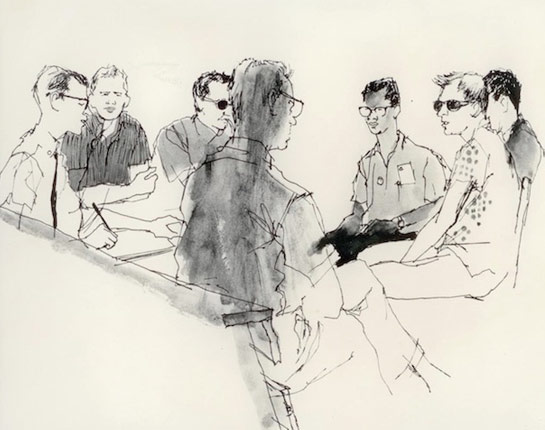
Robert Weaver

a893a43229e2969b1cdd9e21b0e76741.jpg  weaver-ebbetsm.jpg
weaver.jpg robert-weaver.png

“The journalistic approach in art is nothing more complicated than a I desire to tell a story, describe an event, or illustrate a mood. The illustrator has experienced something and he desires to reproduce it. Many painters simply don’t have this desire, but an illustrator who doesn’t have it cannot very well serve the course of journalism.”

Bob Weaver doesn’t set out to “do an illustration” per se, nor does he aspire to produce a timeless work of art. His goal is basically to report; his approach – journalistic, his method – visual notations.

What he also brings along is an extraordinary ability to see and record, and he does this with an integrity that is – if one had to choose – the single most important factor of Weaver’s work.

“I think it’s absolutely essential, so far as is humanly possible, to remove all biases and preconceptions before starting a journalist assignment. We need more good reporting, fewer editorial positions. It’s far more effective to show the villain clearly than to denounce him. I’m not talking about some moral imperative to be ‘fair,’ but what makes for the maximum impact.”

Out of context with the rest of the drawing, Weaver’s line is impatient, blunt, insensitive. it’s not the kind of line you admire for its intrinsic beauty – it has little. Weaver works for the sum total, the completed drawing; and that drawing is both sensitive and beautiful, and interesting contradiction pointing out the fact that a beautiful drawing isn’t necessarily made with beautiful lines.

“Any on-the-spot sketch would provide a welcome sparkle to the printed page – lighten it. There is no doubt there are too many photos cluttering up magazines and newspapers, e.g. the public figure with a lot of out-of-focus bric-a-brac behind his left ear, or the full color photo “essay” which is all design and no content.

A second advantage would be the element of immediacy and spontaneity – rapidly disappearing from the news photo. More and more, it seems to me, the photographer and the subject are in some kind of cahoots; that is, a public figure “performs” for the camera.

Which leads to the third and most important virtue of the sketch report, which has to do with candor and truth. I think that the manipulative techniques of advertising (which is sometimes indistinguishable from the editorial elements of the printed media), the ballyhooing and self-promotion that magazines are indulging in more and more, all tend to create a credibility gap. I believe, then, that the artist could restore to the journals a visual excitement, a more personal view of events, and, finally, a more honest one.”

“You can see the unfamiliar more clearly than the familiar.”

If only a few illustrations attain this (Weaver’s) level of artistry, it is the illustrator himself who is to blame, for his approach is more often to produce something pleasing or novel, or middle-of-the-roadish. He is often more involved in developing a style that an idea.

“ There are too few illustrators who have the skill to communicate anything except very simple ideas. Magazine illustration for me is too decorative, too superficial. The challenge to the illustrator is to use artforms to reveal, to convey the gravity of and to delve into the issues of this particular time in history.

Perhaps its the fault of art schools, but there does seem to be a confusion of roles which leads the young illustrator to think he’s expected to produce works of art which are incidentally reproduced in a magazine. Nothing is more boring than this attempt to marry off the story-telling obligations of illustration with the latest school of painting. First-rate writing is having something to say – and saying it clearly. Illustration is, or should be, visual language.”

Further ObservationNick Meglin was the author of a number of books, many that deal with his years at Mad Magazine where he was an editor. A particular favorite of mine however, was The Art of Humorous Illustration, which is perhaps the first illustration book I ever owned.

the-art-of-humorous-illustration.jpg

Process: Love’s Secrets Revealed

When we fall in love with a picture, it’s almost always at first sight, and that was the case with me recently, on a research trip to the Modern Graphic History Library at Washington University, in St. Louis. (My trip was sponsored by a New Faculty Grant from the Rhode Island School of Design, where I teach.) Like on a Christmas morning, I opened up a box before me, and swooned at what lay inside.

frg2_004

What faced me was a lush, atmospheric, drawing by F.R. (Frederic Rodrigo) Gruger. Created for the September, 1923rd issue of Harper’s Magazine, the picture illustrated “The Lotus Eaters” by Henry James Forman, and it took my breath away. The artwork spoke to all of my personal proclivities; an exciting Italian streetside composition featuring dramatic light and dense darks. The stunning, monochromatic work drew me into a deep space, and to a far away place of wonder.

IMG_1056

My two days of research at the library were dedicated to intense looking and learning from original illustration art, which is seldom seen. Perhaps, they could reveal some secrets.

For instance, how did F. R. Gruger create such convincing light sources in his works? I’m not really a technique geek, but in this case, I was truly curious and envious of his methods. Looking at original art is always revelatory, even if you’re only learning that the art is bigger, or smaller than you expected -having only seen reproductions. In this case, I wanted to know how he got light to pour from that Italian alley.

pl_digitization_waltreed_01_box7_163

Gruger’s work, like most of the other illustration artworks that I examined that day, was created on “illustration board” a kind of cardboard. Actually, the board he used was cheap, but made famous by his work, and referred to, in time, as “Gruger board”. The drawing itself was created with a carbon pencil, and didn’t look as much like a charcoal drawing as it does in reproduction. A matted border had perhaps been glued around the picture before, and it left an ugly discoloration at the margins, perhaps because of glue.

The board was gray, and I was surprised to find no white paint or marks, in the brightest parts of the picture. Rather, the brightest brights were just the untouched board. Looking closer, especially at the margins, I could see that this carbon pencil drawing, was drawn over a toned wash of gray ink, or watercolor.


Gruger 003

F. R. Gruger was a famous and infuential illustrator of his day: the 1910’s and 20’s. Known for  his “innovative technique.” he was refered to, in his  Society of Illustrators Hall of Fame profile as “an artist’s artist” – the envy of his peers. Actually, he so intrigued them, that a cartoon of him was created by another illustrator (seen above), showing a knight guarding his studio, and the process secrets therein.


pl_digitzation_waltreed_01_box03_142

Examining a second drawing, I noticed, what might have been his luminosity trick. That is, when Gruger lay down the grey wash on which he alway drew with pencil, he left specific places untouched – and in doing so, it made all the difference.

Looking closely at the illustration above, the man’s face, shirt and hands, along with the hole in the ceiling above, are untouched by the grey -so they appear to shine. In the “Lotus Eaters” illustration, Gruger left the brightest brights untouched, too. Both drawings have specific exceptions to his value range. And this trick is hard to see in reproductions of the art, like the one below, or in a framed piece, where one can’t know the actual tone of the paper. It’s a good trick, and a very effective one. When the light hits things in Gruger’s pictures, they’re extra bright, and extra convincing.

gruger-bb_13

An amazing piece of detective work? I think not. Nor is it the entire reason for F.R. Gruger’s fame. He was a terrific illustrator: a great draftsman, composer, and interpreter of fiction.

But, it is a testiment to close looking and the patient examinination of original art. Something I’m eager to do again, and soon.


For more about F. R. Gruger, check out the Illustration Art blog.

Further Observation:

In describing his sensibilities, which could be considered as a fondness for the picturesque, Gruger said this:

“One may perceive the charm of smart clothes and exquisite equipment, of beautiful women and well-dressed men, of trimmed hedges and smooth lawns and weedless paths…I could never do anything with it so I left it to others and contented myself with admiration of what they did. For me the weathered street, the lived-in houses, the old trees…Used belongings, comfortably worn and pushed about into homely order long before the incident in the story occurred. To remain, bearing the scars of use, long after it has passed. Perhaps that is the poetry of character. “


Famous Illustrators: Raphael, and His Cartoons

Calling the Renaissance master Raphael, a cartoonist, would certainly be a trick of language. But calling him an illustrator, would not. In 1515, Raphael Sanzio designed ten extraordinary narrative illustrations of the Acts of the Apostles on assignment for Pope Leo X. The images he created were in the form of “cartoons” to be used for tapestries, and later, for prints.

V&A_-_Raphael,_The_Miraculous_Draught_of_Fishes_(1515).jpg

Cartoon by Raphael (The Miraculous Draught of Fishes)

Illustration is the creation of artwork to be seen in reproduced form, and for communication purposes, and Raphael’s work was certainly that. The “cartoon” above is the original art, but not the finished product. The cartoons weren’t created to be seen as  objects. It was the image that was meant to be seen; as tapestries, created in Brussels. If you look closely, you can see that the illustrations were created on many sheets of paper, sealed together. That allowed for the creation of a huge image (nine feet high) that was then translated, in reverse, into huge woven wall hangings.

tap4_1698077a.jpg

Tapestry created from Raphael’s Cartoon

As to the term “cartoon,” we often forget that the illustration-associated word derives from works such as Raphael’s. “Cartoon” is the term for a drawing, usually on paper, from which final art was created. Drawings used for frescos are also called cartoons.

The job for Raphael was no small task. Commissioned by Pope Leo X, the tapestries were created for the lower walls of Sistine Chapel in Rome (We all know what was commissioned for the ceiling). The woven works were made with the most expensive materials, silk from the Far East, along with gold and silver thread. More sets were created from the cartoons through the Eighteenth Century. St. John Divine in New York, holds the only ones in the United States. Of the ten original cartoons created, seven survive, all owned by the English Royal Family, and on loan to the Victoria & Albert Museum in London. They are considered masterpieces of the High Renaissance. Not bad for cartoons.

V&A_-_Raphael,_Christ's_Charge_to_Peter_(1515).jpg

Christ’s Charge to Peter

V&A_-_Raphael,_The_Death_of_Ananias_(1515).jpg

The Death of Ananias

8.jpg

St. Paul Preaching in Athens


Further Observation

A short video of the cartoons and tapestries created to explain a recent exhibit of their reunion:

http://www.telegraph.co.uk/culture/culturevideo/7980678/Raphaels-tapestries-unveiled.html

Bernie Fuchs on Capturing the Viewer – Through Sensation

football

illustration by Bernie Fuchs

In illustration, as in many other things, the more things change, the more they remain the same. How interesting to read from a 1964 Society of Illustrators Annual, and find that the topic of discussion in a Note From the Editor by Bernie Fuch is the exact same topic that we addressed yesterday in my class, as if it were new. That is, in a world of distraction, how does an illustrator attract and connect with an audience? After all, art of the illustrator is not placed in galleries and museums for quiet contemplation. No, illustrators create work for viewers who are not looking for art at the moment that it is seen.

water

illustration by Bernie Fuchs

A Note From The Editor  by Bernie Fuchs from Illustrators ’64

This is not the kind of book you find lying around in dentist’s offices; so it’s a good bet that anyone who peruses it will do so because he especially wants to.

It will have willing interested lookers -people who come to see and ponder the pictures.

Even with this kind of audience it will be necessary to go back several times to really see the pictures.

Compare this audience of art-savvy people to the average thumb-wetter who dashes headlong through a commercial magazine with no idea and little interest in how the illustrations got there. Think of this alarming challenge as you view the contents of this book – and think of it as you face your next rectangle.

police

illustration by Bernie Fuchs

A picture captures a moment, holds it there and allows the viewer to ponder It lays itself open to a multitude of abuses – mainly the fast flip of the page or the nonchalant glance of the reader who has too much on his mind to be bothered. Actually, I venture to say that even very good pictures fare only slightly better than average, or go along with the media research experts, slightly worse than average. To use the phrase probably conceived in the media research, “in today’s fast moving world,” we picture-makers are bucking horrendous odds. Books, movies, plays and TV seize the viewer and hold him through their stories. They give him the nearest thing to the real experience. The most exciting means of expression today, the movie, has a tremendous full-bleed, wide-screen spread with which to engulf the viewer. It can make his eyes move when and where it wants them to with utmost authority. These mediums, with the exception of writing, have three overwhelming assets: sound, visual movement and the ability to tell a complete story with a beginning and an ending (the book having only the latter). A picture has none of these, though some people when confronted with one, state in the dignified vernacular, “That really has movement.” Let’s face it, an image on TV or a musical score literally moves.

Again, the picture has only that tiny instant that it stops forever, and with that it has to make someone see. It has to hold him there long enough for his imagination to wander through the moment and feel, not literally but imaginatively, the sensation of a movement, a sound, a memory or an anticipation of the next instant which can only be conjecture in the mind.

gun

illustration by Bernie Fuchs

Our task is monumental because even if a picture has all these potentials there is no guarantee it will be seen. For, alas, the flippant viewer will not participate. Ashamedly we admit, he has apparently gotten very lazy, -for example, the successfully rated TV commercial which lists the product’s remedies for constipation in oversized handwriting while a well-groomed finger points word for word as it’s read to you.

swimming

illustration by Bernie Fuchs

But, as long as we’re in the business of making pictures, the least we can do is point the finger for him and give him the benefit of the doubt. The only way we can do this is to start with the feeling we want him to end with. We have to portray the right moment and honestly let it happen as we see it. We are lucky in that we spend enough time with a picture so as to allow our imagination to wander and literally move it, either on it’s tumbril or towards a degree of success. The quickest way to the guillotine is to inherit the viewer’s own despondent attitude which ultimately leads to the role of the imitator or the quick-sell solution, while salvation lies within our own imagination, and our willingness to use it. After all, if the research ratings are true, are we not as much to blame for our public’s lazy disposition as he is? Are we expecting him to improve without our help? Are we capable of bucking the odds? —Bernard Fuchs, 1964

cover[11]

cover art by Alan Cober

Further Observation

Bernie Fuchs (1932-2009) was a giant in the illustration field in the second half of the 20th Century; a fixture on the walls of The Society of Illustrators annual exhibitions. In his lifetime, the narrative and decorative norms of illustration art were pushed into more painterly and conceptual directions. Without a doubt, Fuchs pushed the former more than the latter. He led a number of trends of surface exploration, montage and eventually, the use of photography as a basis for paintings featuring exaggerated effects of light.

Cipe Pineles, Ben Shahn and the Birth of Contemporary Editorial Illustration

Md_pinelesc_portrait_640

In 1958, art director Cipe Pineles gave a speech (excerpted below) honoring the legendary artist Ben Shahn, who was then receiving the prestigious Medal of the American Institute of Graphic Arts (AIGA). Pineles describes how Shahn deserves great credit for pioneering a revolutionary idea in editorial art: the use of non-commercial artists for illustration assignments.


Looking back at the speech now, I come to a very different conclusion. It is Cipe Pineles herself who deserved the honor of revolutionary, by making a break from the way illustration assignments were assigned before her. By hiring artists (commercial or non-commercial) as thinkers and not merely as page decorators, as had been previously done, she unleashed the visionary and communicative potential of her visual collaborators. The breakthrough was not in hiring artists, it was in requesting art. Ben Shahn, no doubt, a brilliant artist of commercial and non-commercial work, was the fortunate first person she called upon with this new approach to commissioning illustration. He, like artists after him, was asked to create content as well as form.


Cipe Pineles won the AIGA Honor posthumously in 1996.


Ben Shahn and the Artist as Illustrator


“Some years ago I tried an experiment. I wasn’t the first American art director to introduce the work of painters into mass publications, but I did have an opportunity to do it on an important and consistent scale. I was the art director of a new magazine called Seventeen. It was then a stimulating publication edited by Helen Valentine, who had discovered a new world of young people. People who didn’t yet know that all magazine illustrations had to be made by Jon Whitcome, Al Parker and Bradshaw Crandall, and who hadn’t enough experience to know what an acceptable illustration should be.


497895156_df149b9d12

These young people seemed to represent as nearly an uncorrupted and unprejudiced audience as one could find. I thought there was an opportunity to give them a new experience in seeing, that was spoiled for an old generation. It seemed to me, that if magazine fiction pages were illustrated by painters and that no fuss was made about or special attention was called to that fact, the readers would either accept or reject them without being challenged to accept them as Art. And maybe some young people would be moved by these paintings.


Parker05

At that time, all fiction to be illustrated in Seventeen was commissioned to illustrators in the following way: the fiction editor would type out the specific passage to be illustrated. This passage was arrived at through conferences, and represented the best editorial opinion on just which morsel in the story was the most likely to lure the reader into reading the piece.


My idea was to allow the artist to read as well as to illustrate the story and even to choose the part he wished to paint a picture of. This was an unthinkable proposal, but I was new on that job, and insisted that the artist be allowed to make his own contribution, on the wild theory that he might have a more valid instinct about pictures than a fiction editor could have. 


It might surprise you to know that most painters are frightened by a publishing assignment. They usually want to be told just exactly what it is that you want them to do. Then, when told, they protest that you’ve taken away their freedom. At this point, they will either run away to the safety of their studios or do a job they would be ashamed to put their signature on.


I wasn’t going to let them off that easy.


The plan was to give the artist a story, let him decide what to paint, and insist that we would publish the picture only if he liked it well enough to exhibit it in his own gallery. It would have to stand on its own as a painting—even when it was divorced from the magazine pages it would appear in.


Obviously, the only way a program like this could work was by example. I needed a fellow conspirator. A painter of stature, integrity and courage.


So I asked Ben to help.


5742-2

I remember the first story he did. It concerned a fourteen-year-old boy, a keen tennis player, who is ashamed of his mother because she is very pregnant, and he is determined to keep this fact from his friends. To do this he keeps them from using his family tennis court, which up to the time of the pregnancy had been the center of social activity.


I gave Ben a two week deadline. He could do anything he pleased, in any shape and any number of colors.


There was one restriction. The hero and his friends must be clearly recognizable as youngsters in their teens. 


11497884_2_x

Three days later the finished job came in and it was plenty clear. There was no hero. There were no friends to be seen. Instead, stretching across two pages in a long. thin picture, was the most deserted, clearest, biggest tennis court in a brilliant colour, marked with the sharpest, neatest, traditional white lines. It was a breathtaking beautiful shock of a painting to go with the story. It was also a wonderful painting if you never heard of the story.”


02shahnsml

“With paintings like [this] for a beginning, the success of the project was assured. Ben had opened the way for many more painters to work in the magazine, made it easier for other publishers to open their pages to the work of non-commercial artists.


Further Observation


Cipe Pineles was married to William Golden, who, too, was a legendary art director. Golden worked for CBS and commissioned many memorable illustrations from Ben Shahn.


Md_goldenw_emptystudio_640

History of Illustration: The Monks’ Life Illuminated

Medmonk


Illustrators working long hours and with tight deadlines can sometimes think of themselves as living a monk-like existence as they hunch over their drawing boards for hours. Stephen Greenblatt’s Pulitzer Prize winning book, The Swerve, features some enlightening description of the working life of medieval monks who carefully and artfully copied and illuminated manuscripts day after day after day.


The Value of a Good Artist
“Those who wrote unusually well – in fine, clear handwriting that the other monks could easily read and with painstaking accuracy in the transcription — came to be valued. In the “wergild” codes that the Germanic lands and in Ireland specified the payment of reparations for murder -200 shillings for killing a churl, 300 for a low ranking cleric, 400 if the cleric was saying mass when he was attacked, and so forth — the loss of a scribe by violence was ranked equal to the loss of a bishop or an abbot.”


The Artists Studio
“To assemble a modest number of books, in the long centuries before the invention of the printing press forever changed the equation, meant the eventual establishment of what were called scriptoria.
In the greatest monasteries, increasingly eager to amass prestigious collections of books, these were large rooms equipped with clear glass windows under which the monks, as many as thirty of them, sat at individual desks, sometimes partitioned off from one another.”


13e_1100


The Boss
“The librarian could, if he wished, make a scribe’s life miserable or, alternatively, provide a favorite with particularly fine tools…rulers and awls [to make tiny holes for ruling the lines evenly], fine-pointed metal pens for drawing the lines, reading frames to hold the book to be copied, weights to keep the pages from turning. For manuscripts that were to be illuminated, there were still other specialized tools and materials.”


The Work Day
“Good scribes were exempted from certain times of collective prayer in order to maximize the hours of daylight in the scriptorium. And they did not have to work at night; because of an entirely justifiable fear of fire, all candlelight was forbidden. But for the time — about six hours a day — that they actually spent at their desks, their the lives belonged entirely to their books.”


Oops
“A sheet with a cutout window generally covered the page of the manuscript being copied, so that the monk had to focus on one line at a time. And monks were strictly forbidden to change what they thought were mistakes in the texts that they were copying. They could correct only their own slips of the pen by carefully scraping off the ink with a razor and repairing the spot with a mixture of milk, cheese and lime, the medieval version of our own product for whitening out mistakes. There was no crumpling up the page and starting afresh… Good parchment was far too valuable and scarce to be discarded.”


Monk-at-workwl
“The libraries of the world still preserve a reasonable number of these remarkable objects, the achievement of scribes who lived seven or eight hundred years ago and labored for hours to create something beautiful.”


Grumbling
“…in the margins of surviving monastic manuscripts there are occasional outbursts of distress: “The parchment is hairy” … “Thin ink, bad parchment, difficult text” … Thank God, it will soon be dark.” “Let the copyist be permitted to put an end to his labor,” a weary monk wrote beneath his name, the date, and the place he worked; “Now I’ve written the whole thing,” wrote another. “For Christ’s sake give me a drink.”


Images
Further Observation

Passing On the Brandywine Tradition

Easel_large


Harvey Dunn was perhaps the most highly-regarded illustration teacher of the first half of the last century and influenced many famous artists who studied at the Art Students League in New York and at the Grand Central School of Art. Dunn was so quotable, in fact, that two collections of his teachings, transcribed from students, were published as small books (Harvey Dunn Class Notes and An Evening in the Classroom). Thanks to the internet, Harvey Dunn’s wisdom lives on, despite the books being long out of print.

A star pupil of Howard Pyle (“the Father of American Illustration”) at his Brandywine School of Art, Dunn became the leading espouser of Pyle’s teaching philosophy when he became a teacher himself. Dunn, along with N.C. Wyeth, Maxfield Parrish and Jessie Wilcox Smith, all studied under Pyle and helped form what is known now as the  “Brandywine Tradition” of illustration.


Harveydunn


The reason an illustration teacher of the 1930s and 1940s is of such interest to me is because I am a legacy of the Brandywine tradition. You see, Harvey Dunn was my teacher’s teacher’s teacher. He taught Harve Stein, the founder of the illustration department at Rhode Island School of Design, who taught the award-winning RISD professor Thomas Sgouros, who taught me.

As the next generation of illustration teachers, and because some of my students have become illustration teachers too, I can’t help but wonder what, if anything, is being passed on. Reading these old quotes, I’m pleasantly surprised by the similarities of attitude and approach. A single phrase from a Harvey Dunn exhibition catalogue from The Biggs Museum of Art in Delaware says it well: “As a teacher, Dunn continued in the tradition of Howard Pyle, focusing on ideas rather than technique.”

Hdunn_l

from Harvey Dunn Class Notes by Charles J. Andres, student of Harvey Dunn 1938 – 1941

In his teaching Dunn was more concerned with the essential spirit of the work than technical procedures. “…he never taught what kind of brushes or paint to use. It was merely whether the result had anything in common with the excitement of human existence”

The pictorial idea was essential.  It had to be grasped and held and followed.  Dunn said, “There are ten thousand people in the United States who can paint and draw to beat the band. You never heard of them and  you never will.  They have thoroughly mastered their craft.  And that is all they have — their craft.”

The_prairie_is_my_garden

The pictorial concept indicates or suggests in some manner how to achieve it.  It deals with its spirit, its essence.  Anything less is incidental.  This pictorial concept is the essential thing and it is derived from the spirit or character of the idea. Howard Pyle realized this, and finding the art schools inadequate, started one from which N.C. Wyeth, Frank Schoonover, Harvey Dunn, and many others emerged, forming the “Brandywine Heritage”.

“Teaching is the most important work I have done”

“Mr. Dunn taught art and illustration as one.” -Dean Cornwell (award winning student)

 
Dunn7
from  An Evening in the Classroom; being notes taken by Miss Taylor in one of the classes of painting conducted by Harvey Dunn and printed at the instigation of Mario Cooper,1934 

“Once when I had a little job, the editor said, “Mr. Dunn, don’t spend too much time on these things, we’re not paying you for a lot of work, and they’re not worth it.” And I replied, “Mr. Editor, you may be paying me for these, but I’m really working for this fellow Dunn, and he’s got to be pleased.”

“It’s the invisible something in a picture which makes it a good one.”

“People say to me how wonderful it must be to be an artist, how I must enjoy my work, etc… Not knowing how we have to slave and sweat and struggle and swear before that picture.”

“Don’t make it necessary to ask questions about your picture. Howard Pyle used to say it’s utterly impossible for you to go to all the newsstands and explain your pictures.”

Dunn-sample-03-blog
“Try and make your picture so that a single word or at any rate very few words, would be its title.’
“You haven’t got to make pictures different. They’re bound to be different because you make them.

“The idea is not to “simplify” a picture. Keep your thoughts about it, simple.”

Dunn01

“When you come into the class I asked you if you wanted to be an illustrator and you said you didn’t know. I am reminded of the time we were starting a class in Leonia, (in a house to which clung the odors only years can accumulate) and I asked Mr. (N.C.) Wyeth to come up and talk to the students. Some of them told him they wanted to make money so they could go out and paint and be an artist. Wyeth said: “Fine! — but the only trouble is you’ve got to be an artist before you can be an illustrator.”