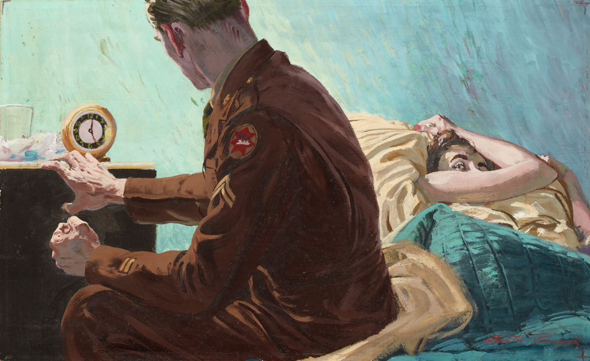
Professor Martin Salisbury of the Cambridge School of Art recently found a nice quote from the great mid-century modern illustrator, Austin Briggs. A founder of The Famous Artists School – a popular illustration correspondence school, Briggs would get inquiries from his students. In the 1961 issue of Commercial Art (now CA) he shared some thoughts on “style”.
Almost every month we have a comment from someone on the (current) “trend.” A trend is almost always a stream of imitation.
The manner should be an integral part of the message the artist delivers – and an imitation of a manner (on the plea that one is being contemporary) is a superficiality imposed upon a picture without enhancing its capacity to communicate. It is a cord around the neck with strangles the voice.
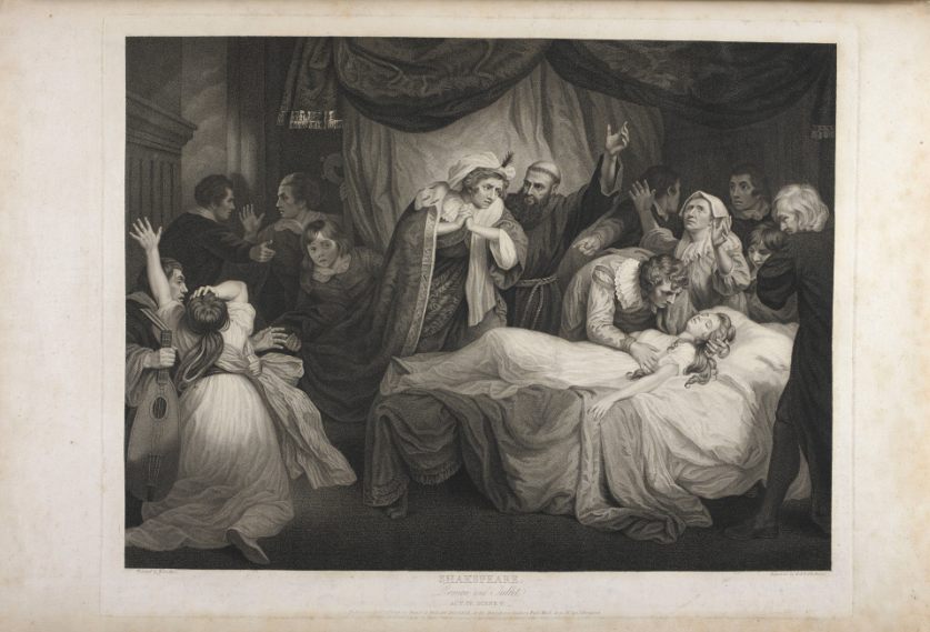
In 1884 the literary journal North American Review published a screed simply titled, Over-Illustration by Charles Tabor Congdon, a New York journalist. To read it is be brushed back by a swinging fist. Perhaps it should read by all illustrators as a provocation.
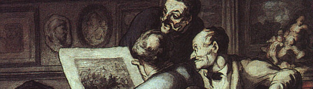
The essay offers criticism, or better yet, an attack – on the then growth of elaborately illustrated books and periodicals – presumably for adults and specifically fiction. In the late 19th Century, newly developed printing methods were facilitating an explosion of illustration and a became showcase for artists like Winslow Homer, Thomas Nast, Kate Greenaway, Howard Pyle, Gustave Doré and A.B. Frost, to name a few. What’s not to like? Plenty, according to Congdon. He names names and is not afraid to be harsh. He takes a big swipe at the illustrations of Shakespeare by John Boydell (shown below). He punches at William Hogarth and Doré as well. To me, those were irrefutable masters of the genre.
Below are a few quotes which spoke to me. Maybe you’ll get your ire up from others from the full essay. I welcome the attack as it provokes me to defend illustration. The genre will always feature positive and negative elements, and it’s instructive to to occasionally reassess its function.
Romeo & Juliet by John Boydell
The ordinary purpose of an illustration is to explain, to elucidate, to render clear what is obscure or abstruse; and this is doubtless the secondary object of the pictorial embellishment of works of literary character. Used in this way, it differs from pictures designed to enhance the sumptuousness of a volume, and to increase its typographical elegance and bibliographical value, which now appears to be the primary intention.
A picture might be made from Shakespeare’s description of the Cliff of Dover, but no picture could add to the sense that he awakens of its loftiness.
Not (William JMW) Turner himself could have added anything from his palette to the exquisite opening of the Fifth Book of “Paradise Lost…”
Most illustration has the demerits of miniature painting without its merits.
It is a remarkable fact that no painter has ever won enduring fame by working from writers, if we except the Bible, which is so much more than any book.
Charles Tabor Congdon
Half of illustration is impertinent. It is a suggestion from somebody who is perhaps less fitted than the reader to judge of what he shall admire the most. It is like the irritating comments that stupid folk scribble upon the margins of the novels. “Is not Jane lovely?” “Beautiful!” “How brave Charles is!”
A scene, an action, an event vividly described by a writer, ought of itself to make a picture in the mind of the reader, and each ought to make his own. They might differ in details, but these are of no importance if only the general spirit of the text be observed. But here the illustrator steps in and makes originality of impression impossible. He takes the work out of the hands of the writer, and dictates to the reader what he will see. No wonder they’re that writers are often ill-content with the illustration that has been vouchsafed for them. The picture can only be one man’s notion of what has been described. It is not a translation: it is not even a paraphrase; it is simply a commentary, wise or unwise, which, even if one had been needed, has not supplied the need: and any literature stamped with such characteristics can only enfeeble the mind and pervert the judgement and diminish the ability to read to any purpose.
We understand perfectly well the innocent pleasure that cheap pictures give: but we understand, also, the the indulgence in this taste may be carried too far and may work harm both to the illustrator and the illustrated. We are living in a time remarkable for a want of great writers in several departments of literature, and it may be questioned whether this unpleasant state of things may not be attributed, in part, at least, to the intellectual indolence that a habit of indulgence in mere picture-gazing may have originated and confirmed.
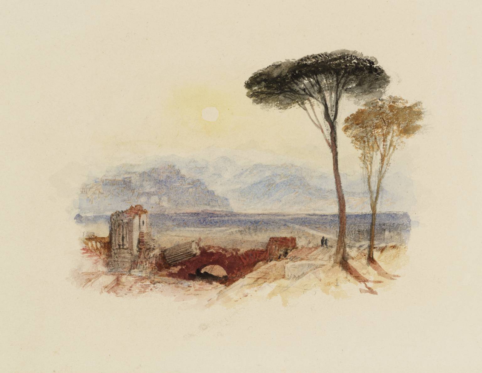
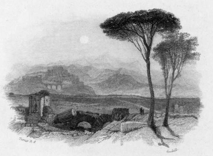
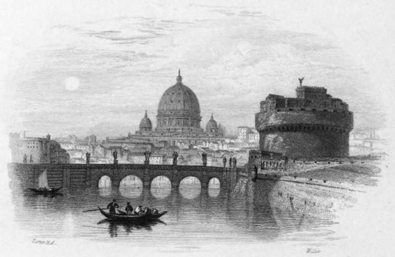
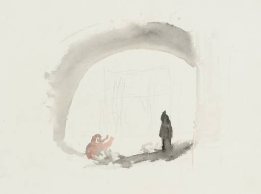
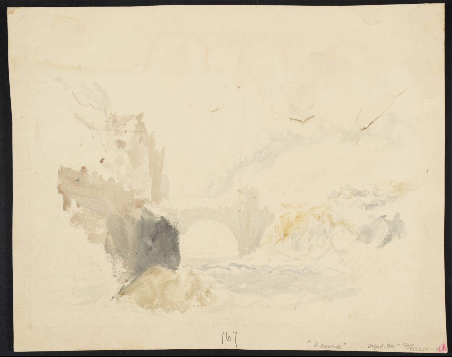
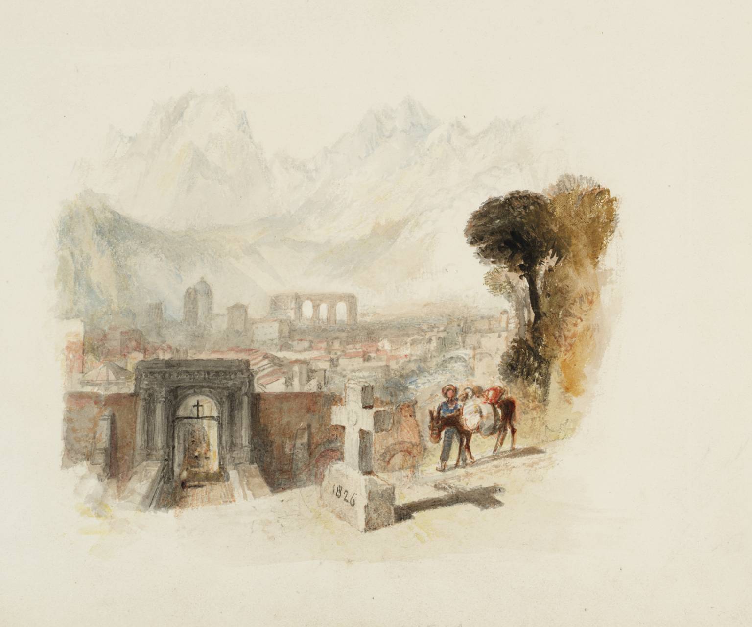
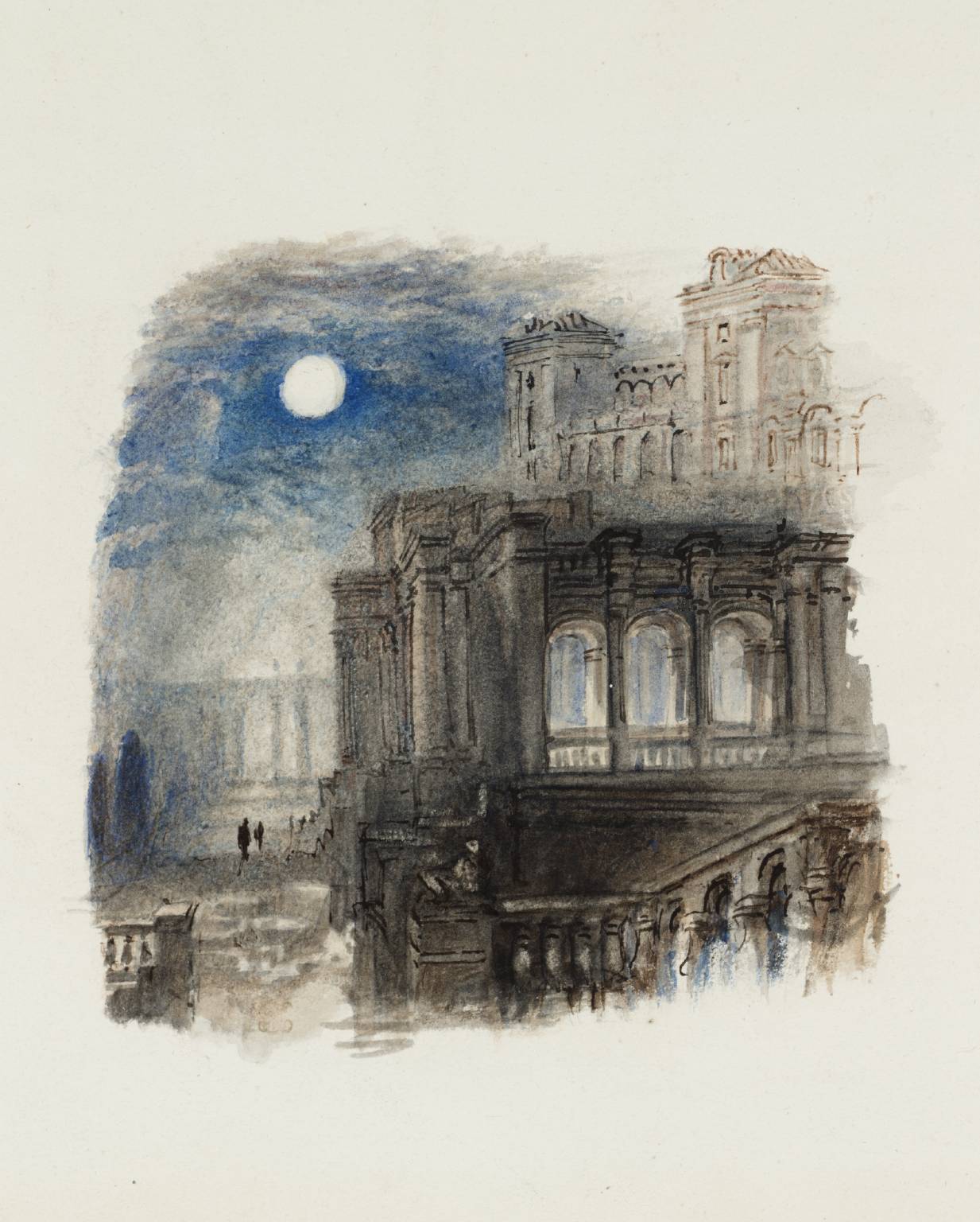
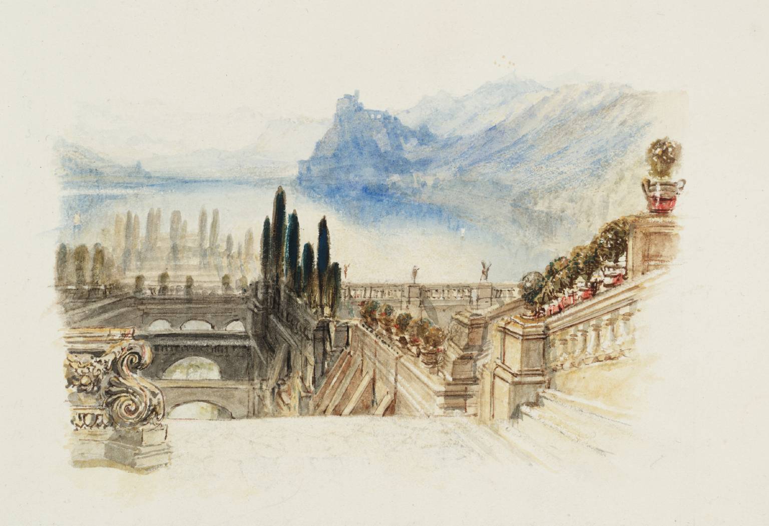
The celebrated English artist, J. M. William Turner (1775-1851) was not only painter; he was also an illustrator. He created images for a number of books of poetry and literature by such writers as Lord Byron, Sir Walter Scott, and John Milton. Most successful perhaps, were his books by Samuel Rogers, which drew on his sketching practice and travel experience.
The esteemed art critic John Ruskin (1819-1900) received one those books, Italy (1830) for his thirteenth birthday and later wrote, “There can be little doubt that the illustrations to Italy and the Poems first made Turner known to the vast multitudes of the English people. One of the most vivid recollections of my own boyhood is the wakening up of a new sense of an ideal world of beauty as I lingered over the lovely landscapes on these delightful pages … there are many whose recollections of these two volumes harmonize with mine, to whom they were an education, and who learned from them to admire Turner before they had actually seen one of his paintings”
While Turner’s illustrations were created with paint and pencil, they were all translated into engravings by other artists, as needed for publication back then. Turner was known for working closely with the engravers, asking for multiple proofs before approving. Turner knew what illustrators know: that the printed piece was the finished piece – the public saw the book, not his watercolors. Both Turner and the engraver of each image signed the illustrations.
Rome (Castle of St. Angelo)
All the illustrations were designed as vignettes– irregularly shaped art without hard borders, which was popular in that booming era of illustrated books. Vignettes, like letters, interact with the white of the page.
The author of The Engraved Work of JMW Turner, R.A. (1908), W.G. Rawlinson described Turner’s illustrations this way:
“Of all the artists who ever lived I think it is Turner who treated the vignette most exquisitely, and if it were necessary to find some particular reason for this, I would say that it may have been because there was nothing harsh or rigid in his genius, that forms and colours melted into each other tenderly in his dream world, and that his sense of gradation was the most delicate ever possessed by man. If you examine a vignette by Turner round its edges, if you can call them edges, you will perceive how exquisitely the objects come out of nothingness into being, and how cautiously, as a general rule, he will avoid anything like too much materialism in his treatment of them until he gets well towards the centre … Turner’s [vignettes] never seem to be shaped or put on the paper at all, but we feel as if a portion of the beautiful white surface had in some wonderful way begun to glow with the light of genius.” -from the Tate.org
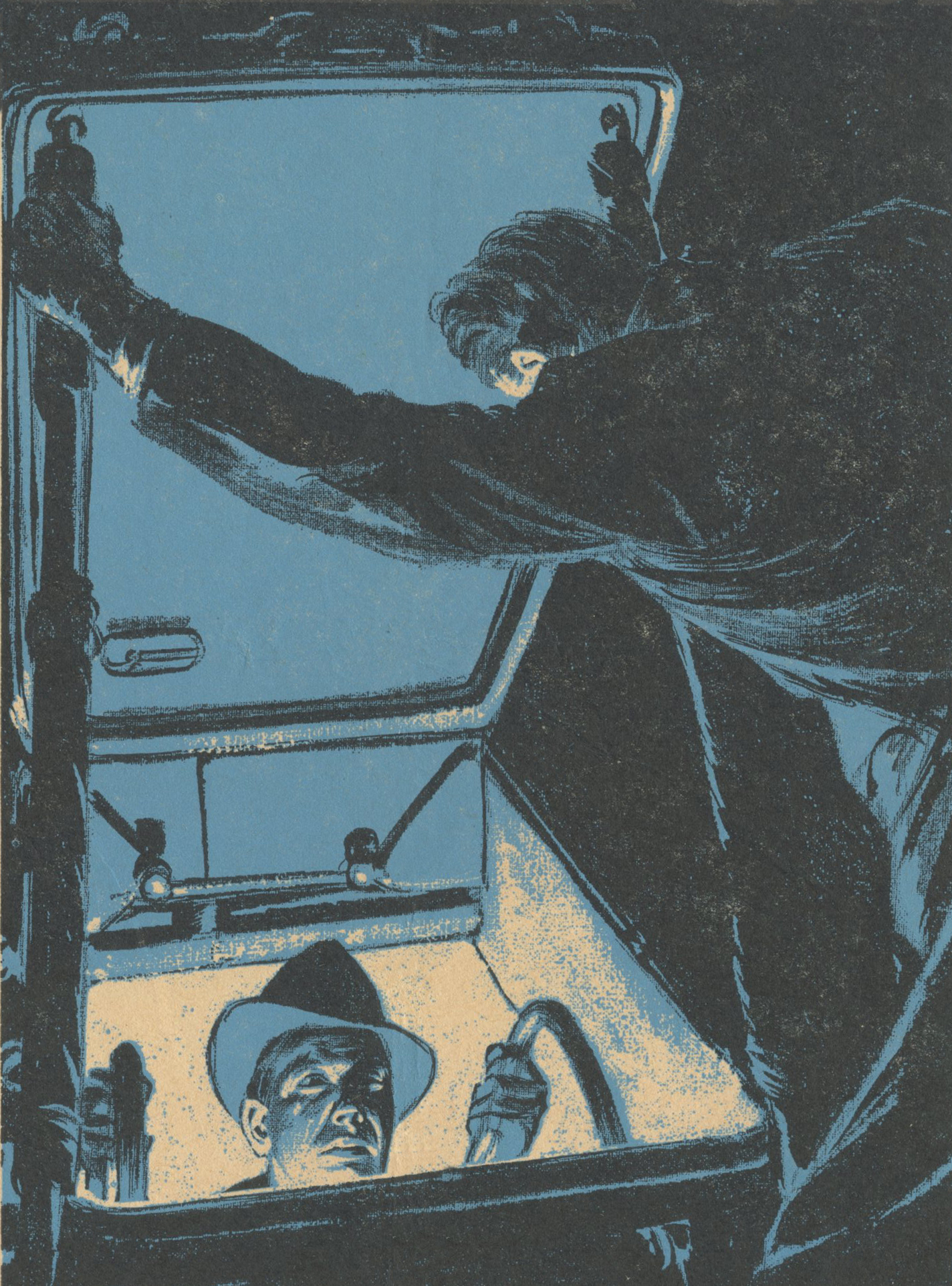
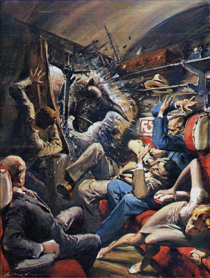
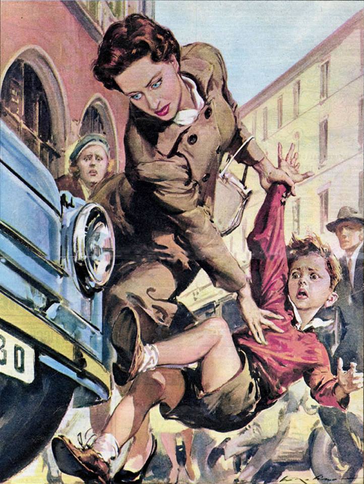
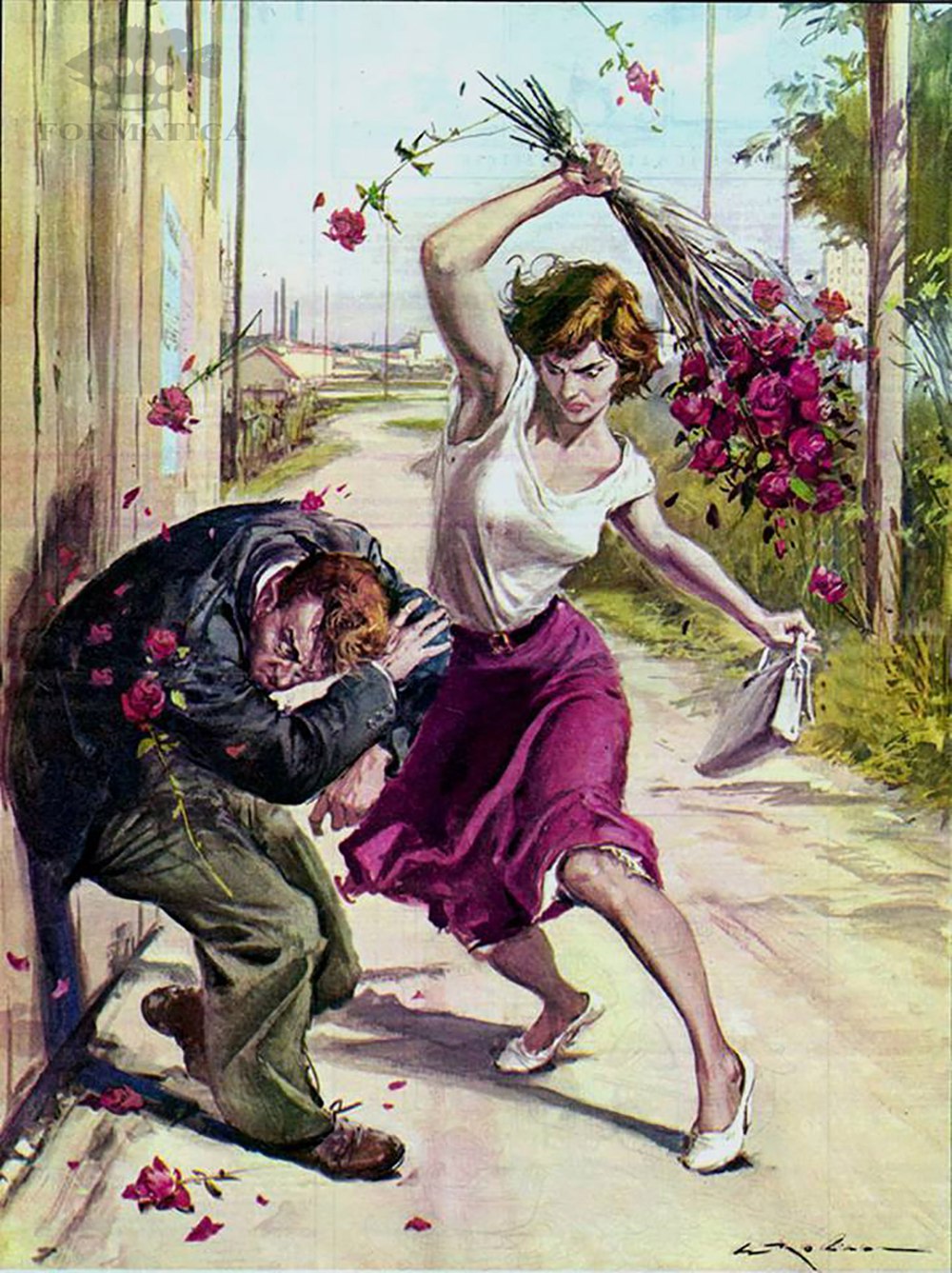
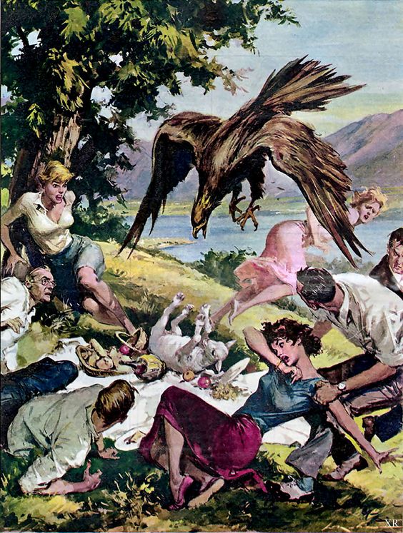
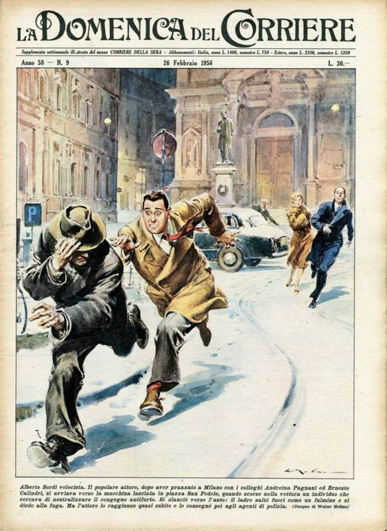
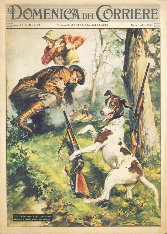
Walter Molino (1915-97) was an illustrator of the worst possible circumstances. In image after image, and in precise frozen detail, he pictured mayhem and madness, and desperation and destruction. His illustrations are so extreme that they’re hard to look at, never mind think about. Most are examples of gratuitous violence, serving no purpose but for lurid entertainment. However, whether you love them or hate them, they are very successful in their intent—to shock. They are effective designs of gasping awe. By examining some of his less extreme images (believe it or not), we can learn from his strategies for success.
First comes concept—always. Molino had a vivid imagination. His stories he creates connect with viewers at a sensory level. Viewers identify with the subjects and situations, even though they were so over-the-top.
Molino’s style and substance match perfectly. His very realistic style and his cinematic way of picturing things are well connected with the storytelling. The flawless anatomy, extreme foreshortening, and difficult perspectives are masterfully done and are far more effective than a cartoony, or less vivid alternative.
The images present a clash of the ordinary and the extraordinary— of fact and fiction. In an ordinary town, on an ordinary day, a truly terrible or dramatic thing happens. This is not sci-fi or fantasy. We recognize these to be of our world, as we see it and fear it.
Finally, these are very illustrative. They speak to the power of drawing and painting. An illustrator should always be offering an alternative to photography and these “realistic” images do just that. The pictures are created from scratch and designed for maximum effect. The images are extreme reality. While Norman Rockwell created heightened “realistic” images of warmth and sentiment, Walter Molino created them for drama and destruction. Comparing their concepts, colors, and compositions can teach you a lot about illustration.
Further Observations
Often, I recommend that my students avoid placing their main characters in the center of the picture because it creates a dull image. Molina reminds us that no rule is universal. He centers things often and very effectively—by exploding the action from the middle of the picture with lots of diagonals.
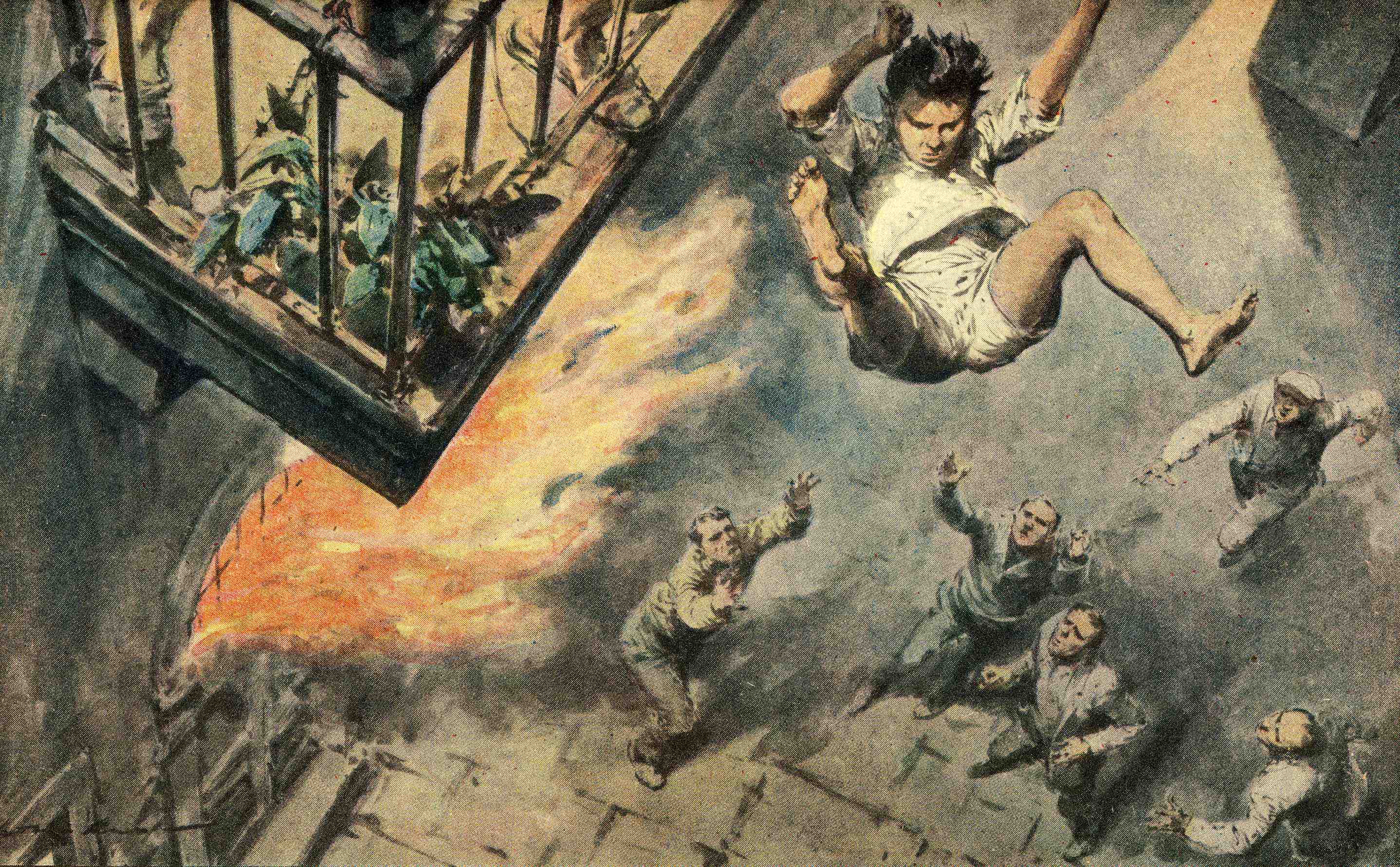
This final image is an exception and more in line with my teachings. The artist hangs the sympathetic character from the top of the page, and we feel the space below by anticipating the fall. Viewers read all pages from left to right and but from top to bottom, and in this case the read is designed to heighten drama. We travel with our eyes from the balconey in the top left, down to the recuers in the bottom right.
Finally, notice too, that there is more than one kind of perspective at work here. In addition to traditional perspective, Molino uses “atmospheric perspective,” too. The forground character (the boy) has darker and lighter tones than the rescuers below. That helps our brain to understand that the boy is closer to us (and not simply a giant), and that those below are further away (rather than tiny people). The atmosphere has that effect on our perception, and replicating it in a picture helps communicate distances clearly.
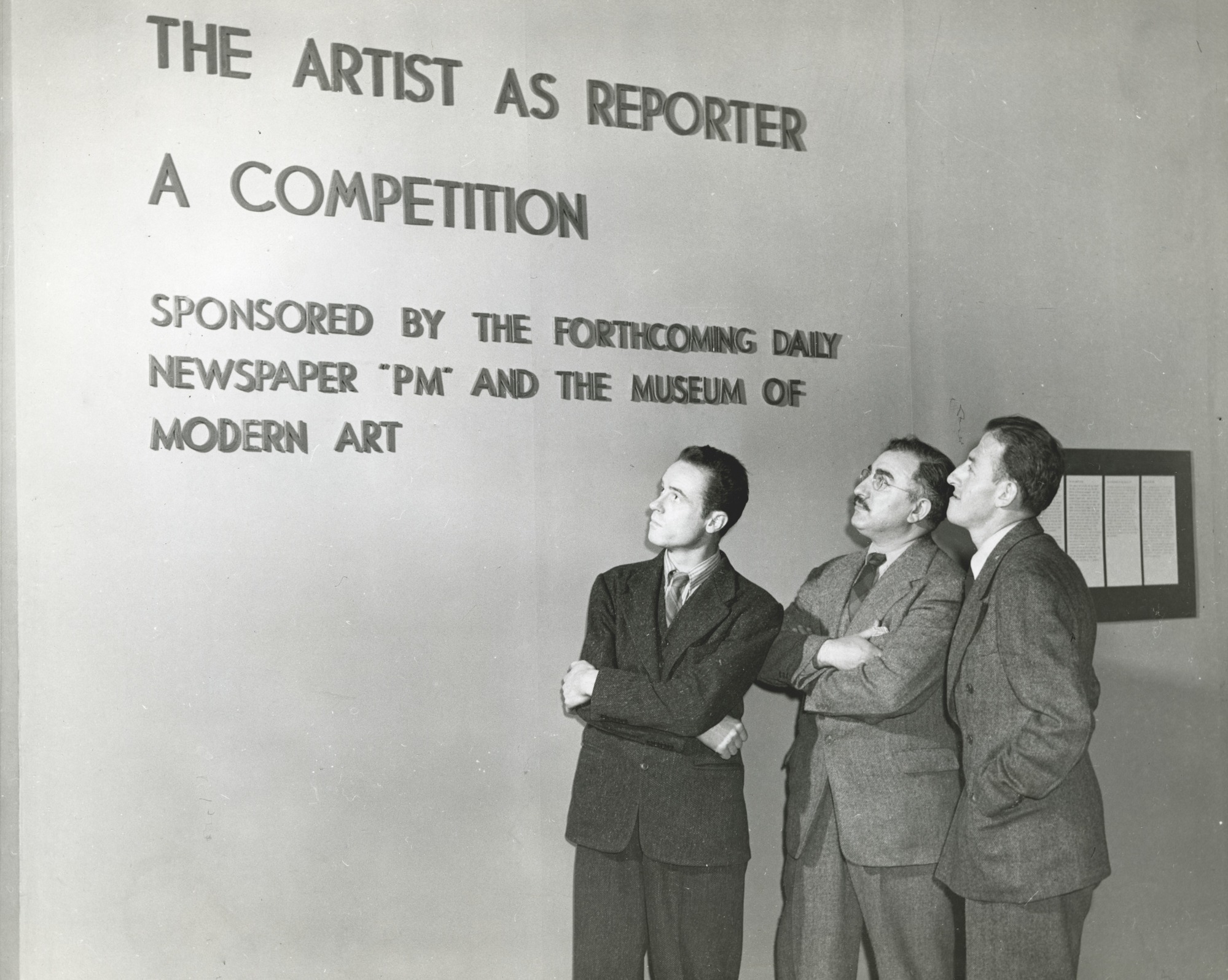
In 1940 the Museum of Modern Art (MoMA) in New York staged an unusual competition exhibition – The Artist as Reporter. It was co-sponsored by the soon-to-debut PM newspaper as “a search for artists who could report the news with brush and pen.” A call for entries went out to 10,000 artists in New York and beyond, and the best entries were to be selected by a jury of distinguished artists including John Sloan and William Gropper. $1750.00 dollars in prizes were offered ($30,813.00 in today’s dollars) including one prize was chosen by visitors to the exhibition.
In the press release, Nelson A. Rockefeller, president of the Museum of Modern Art, said in announcing the competition, “The Museum of Modern Art is always eager to encourage new avenues of opportunity for the American artist. That is why we are delighted to cooperate in this competition, which promises to open up new possibilities for the artist and to expand the field of journalistic art. In this connection it is interesting to recall that the work of Winslow Homer, one of our greatest artists, first came prominantly to public notice when he was a pictorial artist for Harper’s Weekly. And the tradion of journalistic art (which one gave employment to hundreds of artists) has associated with it the names of such outstanding American artists as George Liks, William J. Glackens and John Sloan.”
Call for Entry
In the call for entries, Journalistic Art is defined:
“What is Journalistic Art? It may be a drawing or painting of some violent or dramatic action, a rescue at a fire, a strike scene, a police raid, a prize fight. And certainly the whole world of sports. Or it may be a sketch of faces in the news: well-known faces of politicians, criminals, attorneys, theatre people; or of unknown faces, of people the news affects – wives waiting at a mine rescue, men on a picket line, children on the impatient line for “Pinocchio.”
Or a picture could be a record of contemporary scenes that will one day spell 1940: workman patching the Trylon at the World’s Fair; a man selling “Confucious Say” handbills on Broadway. It could be, too, a purely descriptive picture of a parade, a horse-race, a crowd in the bleachers.
These then would be journalistic pictures, with the Artist as Reporter. And there are many others. The news-minded artist will discover them for himself.”
1,926 entries came in for the competition (1,463 from New York) and approximately 200 were chosen for the show. Familiar names (to me) among the included artists were artists Ben Shahn, Philip Guston and Reginald Marsh along with New Yorker magazine cover artists Arthur Getz and Garrett Price. Abraham Jaffee (better known as Al Jaffee of MAD Magazine fame) was also in the show, along with Richard Scarry, the legendary children’s book artist (the creator of Busytown).
There was a descent number of women in the exhibition as well, for the time: Nan Lurie, Elizabeth Olds, Lisa Rhanna, Wilma Riley, Doris Rosenthal, Julia Rogers, Georgette Seabrooks, Bernarda Byson Shahn, Helen R. Stoller and Sylvia Wald.
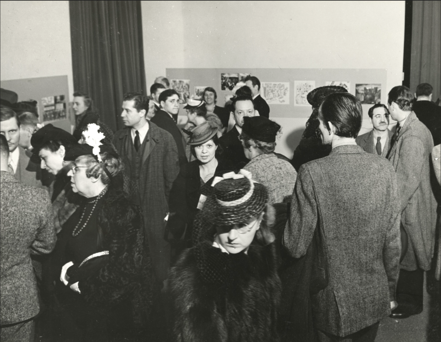
Opening Night
PM went on to be a very influential but short-lived newspaper. The very visual paper featured over 400 comics by Dr. Seuss, and also a comic strip (Barnaby) by Crockett Johnson, who later wrote Harold and The Purple Crayon. Another contributing artist was the abstract expressionist, Ad Reinhardt. Among the many photographers who published were Margaret Bourke-White and Arthur Felig – better known as “Weegee”.
More information can be found at the MoMA website.
Further Observation
At the end of the Call for Entries comes this curious addition: “P.M. doubts that staff jobs with salaries is the best way to employ artists. Rather it believes in finding and knowing 30-40 artist whom it may call on.”
I wonder if the participating artist would agree with that.
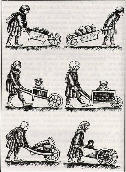
“I remember a story that my father used to tell of a traveller in 13th-century France who met three men wheeling wheelbarrows. He asked in what work they were engaged and he received from them the following three answers:
The first said, “I toil from sunup to sundown and all I receive for my pains is a few francs a day. ”
The second said, “I’m glad enough to wheel this wheelbarrow for I have been out of work for many months and I have a family to support.”
The third said, “I am building Chartres Cathedral.”
-from The Shape of Content by Ben Shahn, 1957, Harvard University Press
“I’m an illustrator. Most artists, if they’re painting something and you don’t understand it, that’s your problem. If I illustrate something and you don’t understand it, I failed.”
-Joe Krush (100 years old this week) who illustrated often with his wife, Beth.
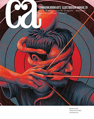
Seventeen years ago, I tracked the growth of “digital” artmaking by examining a number of old Communication Arts Illustration Annuals. Because the yearly issue includes a description of artists’ media use, I was able to use that information to catch a glimpse of the pace of growth of the use of digital tools from year to year in their survey of outstanding illustration.
Some artists didn’t list their media, so I didn’t count them. Also not included, were those works described as “mixed media” because the term is non-specific.
Here’s what I learned from this year’s issue, and a comparison from my calculations from the past:
In the 2018 Annual:
73% of the entries described “digital” as part of the creation process*.
43% of the entries described “digital” as the only medium.
In the 2011 Annual, 54% of the entries described “digital” as part of the process.
In the 2010 Annual, 44% of the entries described “digital” as part of the process.
In the 2005 Annual, 29% of the entries described “digital” as part of the process.
In the 2000 Annual, 12% of the entries described “digital” as part of the process.
In the 1995 Annual, 3% of the entries described “digital” as part of the process.
In the 1990 Annual, .5% of the entries described “digital” as part of the process.
In the 1985 Annual, 0% of the entries described “digital” as part of the process.
*Series of works were counted as one entry because all were described as of the same media and artist). “Mixed media” was not included, due to vagueness. Entries with no description of media were included in the calculations.
“The gag itself comes first and is the more difficult than the drawing part of cartooning.” -Ernie Bushmiller, cartoonist of Nancy
“Before the cartoonist puts pen to board, before the cartoonist puts pencil to notebook, before the cartoonist does anything fruitful with the pulp based product or any sort of pointed object, the cartoonist must first think. The ability to regularly generate useful concepts is at the core of the creative practice.”
“According to Bushmiller confidant and fellow comic strip artist Morris Weiss: “Ernie would go into a trance and he would be completely oblivious to everything around him…Most of his time was consumed with coming up with ideas…His whole life was coming up with gags.”
-from How to Read Nancy: The Elements of Comics in Three Easy Panels by Paul Karasik and Mark Newgarden, Fantagraphics Books, 2017
“Put it before them briefly so they will read it, clearly so they will appreciate it, picturesquely so they will remember it and, above all, accurately so they will guided by its light.”


 “Put it before them briefly so they will read it, clearly so they will appreciate it, picturesquely so they will remember it and, above all, accurately so they will guided by its light.”