Levels of Picture Engagement How Low Can You Go?

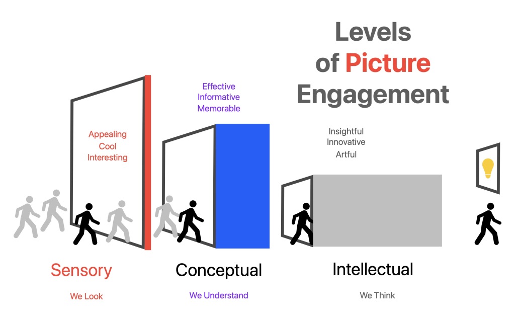
Some pictures we remember. Most we don’t. They go in one eye and out the other, to steal a phrase. Still fewer open our eyes and change our perceptions.

As an illustration professor, I’m often advocating for pictures that are more resonant. I’m looking for deeper images – ones that are more than a just a pretty picture. So to help make my point, I’ve been trying to picture how images can deliver more for the viewer. I tell my students, that the more you put into a picture, the more a viewer can take out. But I’m not talking about more details, or more complication. Confusion and exhaustion are not good ways to communicate. It’s what’s behind the image that counts – the depth – the layers of meaning.

Imagine that there are three levels of engagement that a picture can offer, and that the very best illustrations reach all three.

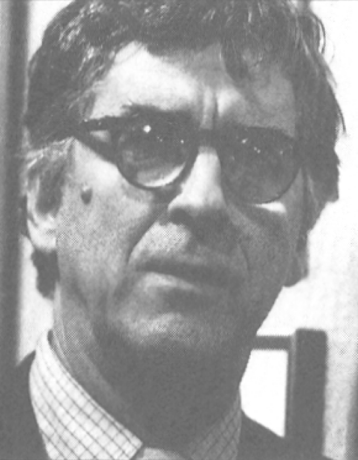
(Bob) Dylan by Milton Glaser, 1966

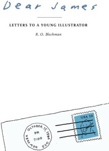
Book Look: Dear James: Letters to a Young Illustrator

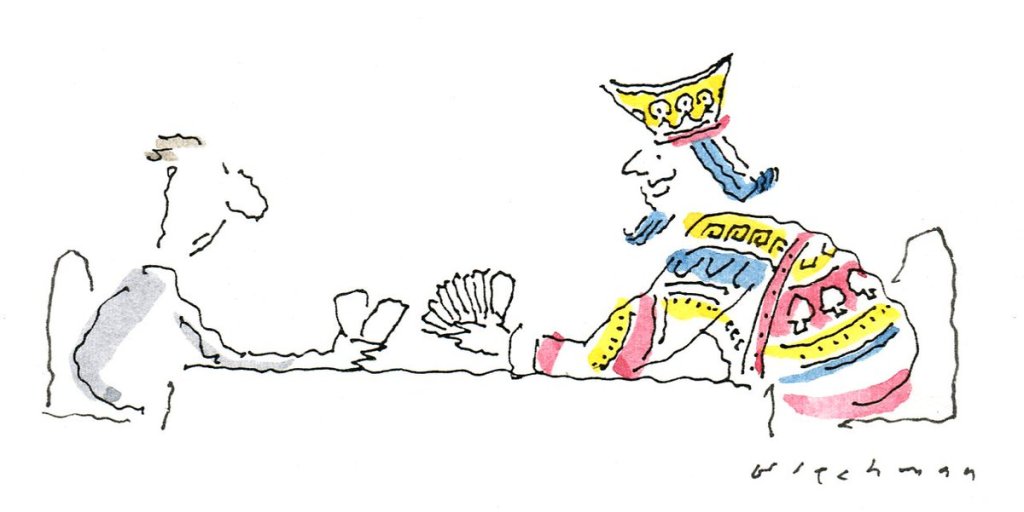
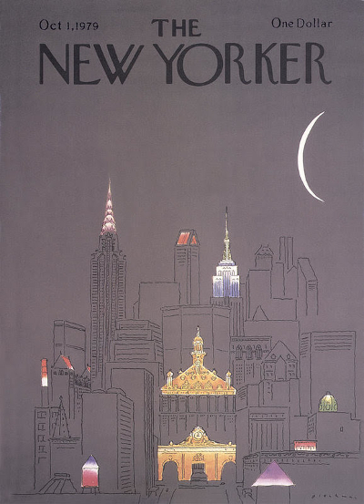
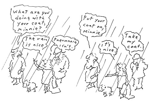
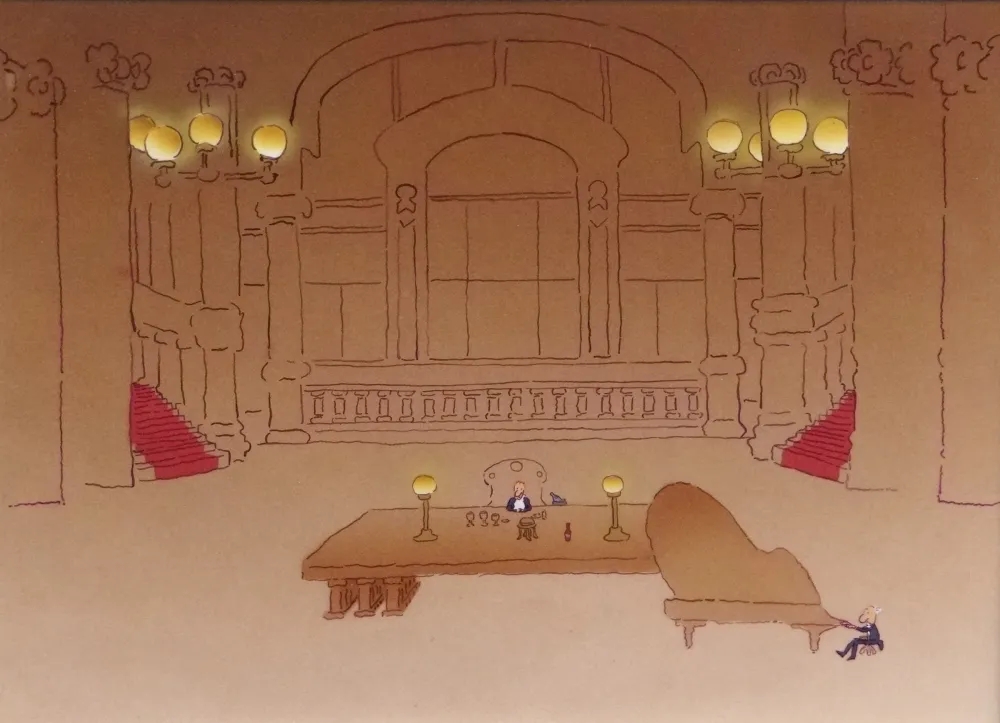
R. O. Blechman is a renown illustrator and animator. It’s easy to recognize his thin wiggley line-work and quietly clever concepts. He’s won all the awards, written a number of books and succeeded for a very long time in the fickle business of commercial art. That’s why his wisdom is so welcome, and in his slim book, Dear James: Letters to a Young Illustrator (2009, Simon and Schuster), there are plenty of useful nuggets. The premise of the book is a fictional correspondence exchange, just as the title says. Here I share some of my favorite passages. Buy the book and you can share your own. I categorized themes below myself.

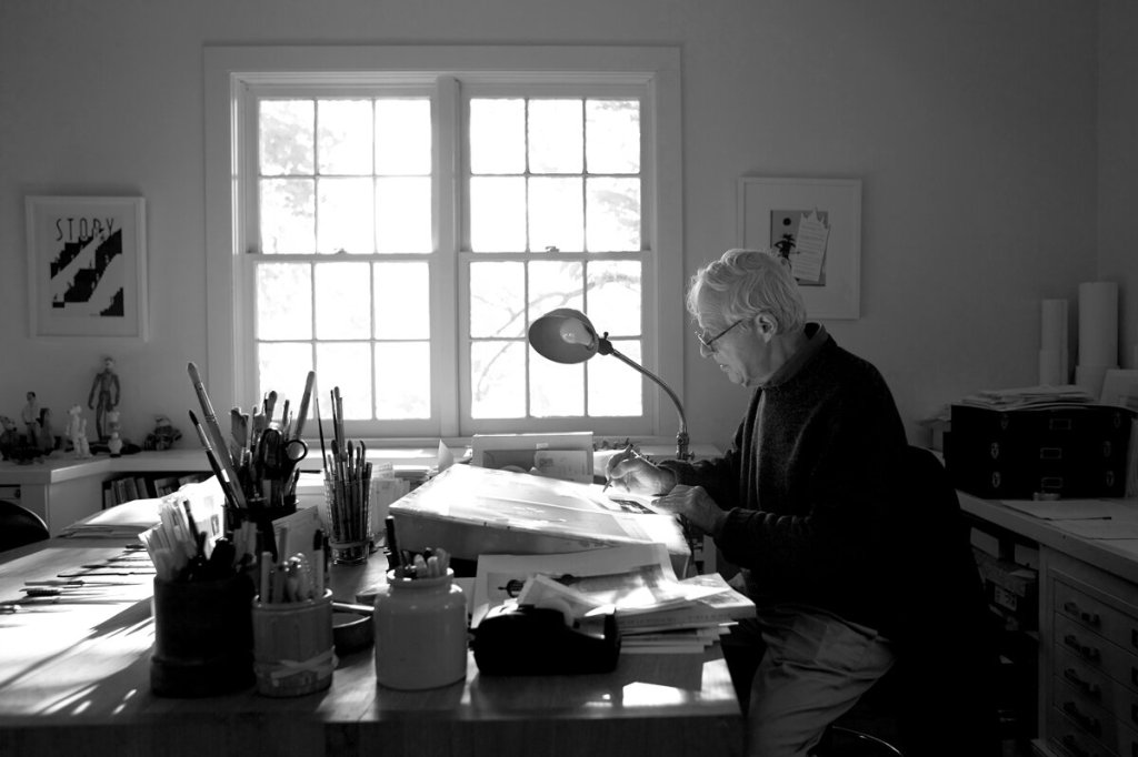
Photograph of R.O. Blechman by Maria Spann

Times have Changed

A while back I wrote of the unequal relationship between writer and illustrator, and I can do no better than to repeat myself. If a text read, “Bill kissed Sally in a hammock as it swayed gently between the hemlocks,” the illustratorʼs job is to strictly render Bill kissing Sally in the hammock as it swayed gently (no vigorously!) between the hemlocks (not pines!). 

It was not for the illustration to aspire to the status of literature, as Anton Chekov described it: ‘The moon reflected in a piece of glass at the bottom of a stream.ʼ Illustration was the moon, period. Or the glass, period. Nothing less, nothing more – no reflections, no distortions. 

That has changed. In the mid-fifties, a revolution occurred and a new word entered the vocabulary of commercial art. Concept. Illustrators asked themselves, “Whatʼs the idea behind the text? How can we express an idea, and express it in a novel, and maybe even startling way, that will expand, or comment upon the text?” In jazz parlance, a theme had become the occasion for a riff. Pranksters with our pens, we had become so many Charlie Parkers. 

But the change was not entirely good. Our gain was a loss. 

The literal approach to text implied a literalness of technique and a high level of draftsmanship. There was great value in something well observed and carefully delineated. If the head and heart were often absent, there was something to be said for presence of hand. 

Where to Get Ideas

A great deal of A.E. Housemanʼs poetry was composed when he was away from his desk. He habitually took a stroll for two or three hours a day. It was then, he remarked that “sometimes a line or two of verse, sometimes a whole stanza at once,” would spring int mind. Montaigne also found that many of his ideas occurred when he was away from his worktable. However, he complained, his best ideas came when he was on horseback, far from quill and parchment. You’ll find… that when you’re most relaxed, which is to say the least self conscious, you’ll be at your most creative. 

Day Job and Artist?

Anton Chekhov, a practicing doctor and writer expressed his double life in a charming manner:

“I feel more contented and more satisfied when I realize that I have two professions, not one. Medicine is my lawful wife and literature is my mistress. When I grow weary of one, I pass the night with the other. This may seem disorderly, but it is not dull, and besides, neither of them suffers from my infidelity.”

Committing to an Idea

An admirer of Goethe, W.H. Murray had this to say about the importance of beginning a project:

“Until one is committed, there is a hesitancy, the chance to draw back, always ineffectiveness. Connecting all the acts of initiative (and creation), there is one elementary truth that ignorance of which kills countless ideas and splendid plans: that moment one definitely commits oneself, then Providence moves, too.”

Goethe himself wrote:

Whatever you can do or dream you can, begin it. Boldness has genius power and magic in it.”

Finding Opportunities

Waiting around to get a commission is not the best way to get one. A person has to move around to see people, to speak to them, and then – just maybe-something will happen, somebody will be interested in what you have to offer. It’s the accidental encounter, the happenstance that moves a ball to those high-number bulbs in a pinball machine. 

Style & Substance

An old vaudeville act would have two men dressed in a horse’s costume. One would be in front, the other in back. The two vaudevillians would then act bin tandem. Illustration is like that. The idea is only one part of the “horse.” The other is the rendering. They have to act in unison for the art to work. 

Finding a Style

When I started out, I worked in several different styles – a cross hatch, a tight line, a stitched line (an innovation of Ben Shahn’s, incidentally, who had a had a great influence on illustrators in the 1950’s. Andy Warhol, for example, when he first entered the illustration field, used a stitched line in his work), and, yes, in addition to this stylistic approaches, I used a shaky line. That last look was the direction I liked best, and that’s what I chose to develop. So, you see, it was both something natural and artificial. It was nothing that I was fated to use. It was something I preferred to use. 

Art vs Illustration

This distinction would have seemed pointless, if not absurd, to a Renaissance artist. Botticelli’s contemporaries admired his illustrations no less than his canvases – and no wonder. His drawings for the Divine Comedy were…well, Devine. To an artist of the sixteenth century, the scale and use of his work were irrelevant. Only the visual; quality mattered.

How damaging, how destructive, this culture gap between the art forms! It drove a supremely gifted Maxfield Parrish from the sublime illustrations of his books to the kitschenware of his paintings. It occasionally turns an Andre Francois away from his natural bent as a superb illustrator to the sometimes pretentious one of a gallery artist. 

The unique advantage that an illustrator has over a painter is the illustrator has the gift of boundaries. A text limits an illustrator’s options, and this can be liberating, not restricting. “(Nothing) is harder to bear than complete freedom,” remarked to art critic E.H. Gombrich.

Be Human

Did you know that the human face is not symmetrical? One side is slightly (but imperceptibly) different from the other. That might be God’s way – or nature’s as you wish-to tell us something. Carpet weavers in the Near East know that. Their carpets are always slightly asymmetrical. A color or a pattern is never repeated exactly. That puts the human signature to the work. It’s not any different from the signature that you find in a drawing when a line is crooked or broken., or a blob of paint forms, but failing in just the right place. The “flaws” are what connects us to the work – that say “a person has made this.”

Tastes Change

The problem with being a freelancer in any of the creative fields is that taste changes, and with it styles. In our field, art directors and creative heads are always on the move – in one day, out the next – and the new guy wants to put a fresh stamp on the job by finding something and somebody fresh on the page. Not always the worst thing. After all, the point of any drawing is be looked at, and if it’s something you have seen before – and seen again and again – the ho-hum factor kicks in, and that most dreadful closure takes place:a page, barely danced at, is quickly turned. (I’ve even done that with one of my favorite artists: Steinberg. I once caught myself all to quickly flipping over a spread of his New Yorker drawings.. Been there, seen that, But Steinberg, it seems, feels the same way about his own work. He can be bored with his own stuff, so he’ll move to another look, another medium, always one step ahead of his audience.)

Crash, Bang, Boom: The Unsettling Illustrations of Walter Molino

50af7156ce6035933de38ccc4cfac2df-walter-obrien-art-illustrations

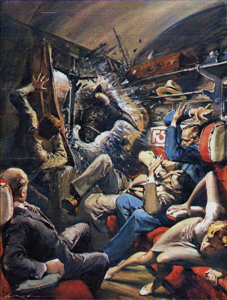
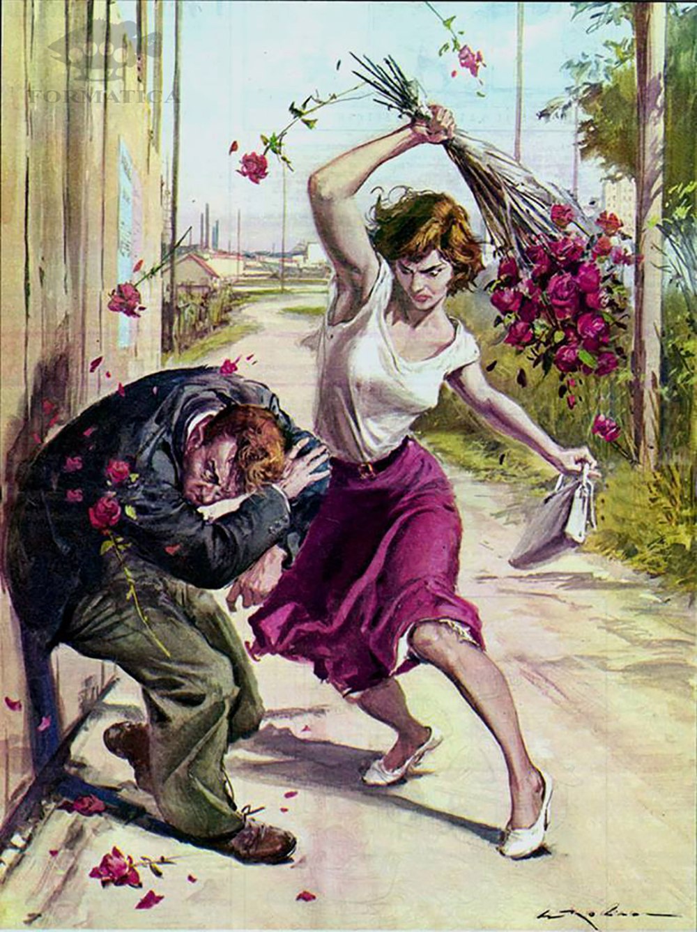
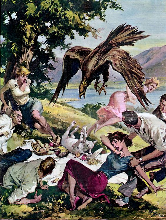
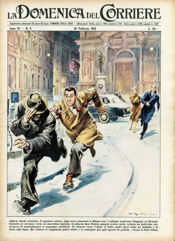
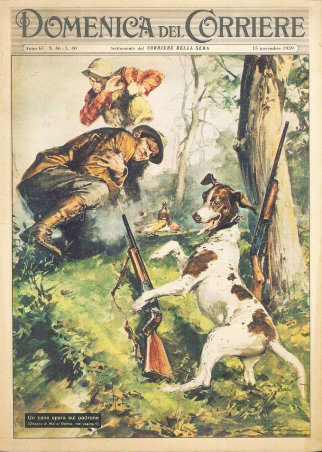
Walter Molino (1915-97) was an illustrator of the worst possible circumstances. In image after image, and in precise frozen detail, he pictured mayhem and madness, and desperation and destruction. His illustrations are so extreme that they’re hard to look at, never mind think about. Most are examples of gratuitous violence, serving no purpose but for lurid entertainment. However, whether you love them or hate them, they are very successful in their intent—to shock. They are effective designs of gasping awe. By examining some of his less extreme images (believe it or not), we can learn from his strategies for success.

V1Sbjiw

First comes concept—always. Molino had a vivid imagination. His stories he creates connect with viewers at a sensory level. Viewers identify with the subjects and situations, even though they were so over-the-top.

Molino’s style and substance match perfectly. His very realistic style and his cinematic way of picturing things are well connected with the storytelling. The flawless anatomy, extreme foreshortening, and difficult perspectives are masterfully done and are far more effective than a cartoony, or less vivid alternative.

The images present a clash of the ordinary and the extraordinary— of fact and fiction. In an ordinary town, on an ordinary day, a truly terrible or dramatic thing happens. This is not sci-fi or fantasy. We recognize these to be of our world, as we see it and fear it.

Finally, these are very illustrative. They speak to the power of drawing and painting. An illustrator should always be offering an alternative to photography and these “realistic” images do just that. The pictures are created from scratch and designed for maximum effect. The images are extreme reality. While Norman Rockwell created heightened “realistic” images of warmth and sentiment, Walter Molino created them for drama and destruction. Comparing their concepts, colors, and compositions can teach you a lot about illustration.

0-13    f2d69278a5a6e4f3e6e78619856e5dec

c17c426b7f8322329a9fd484612cf319      walter-molino-03-665x932

Further Observations

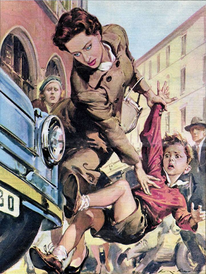
Often, I recommend that my students avoid placing their main characters in the center of the picture because it creates a dull image. Molina reminds us that no rule is universal. He centers things often and very effectively—by exploding the action from the middle of the picture with lots of diagonals.

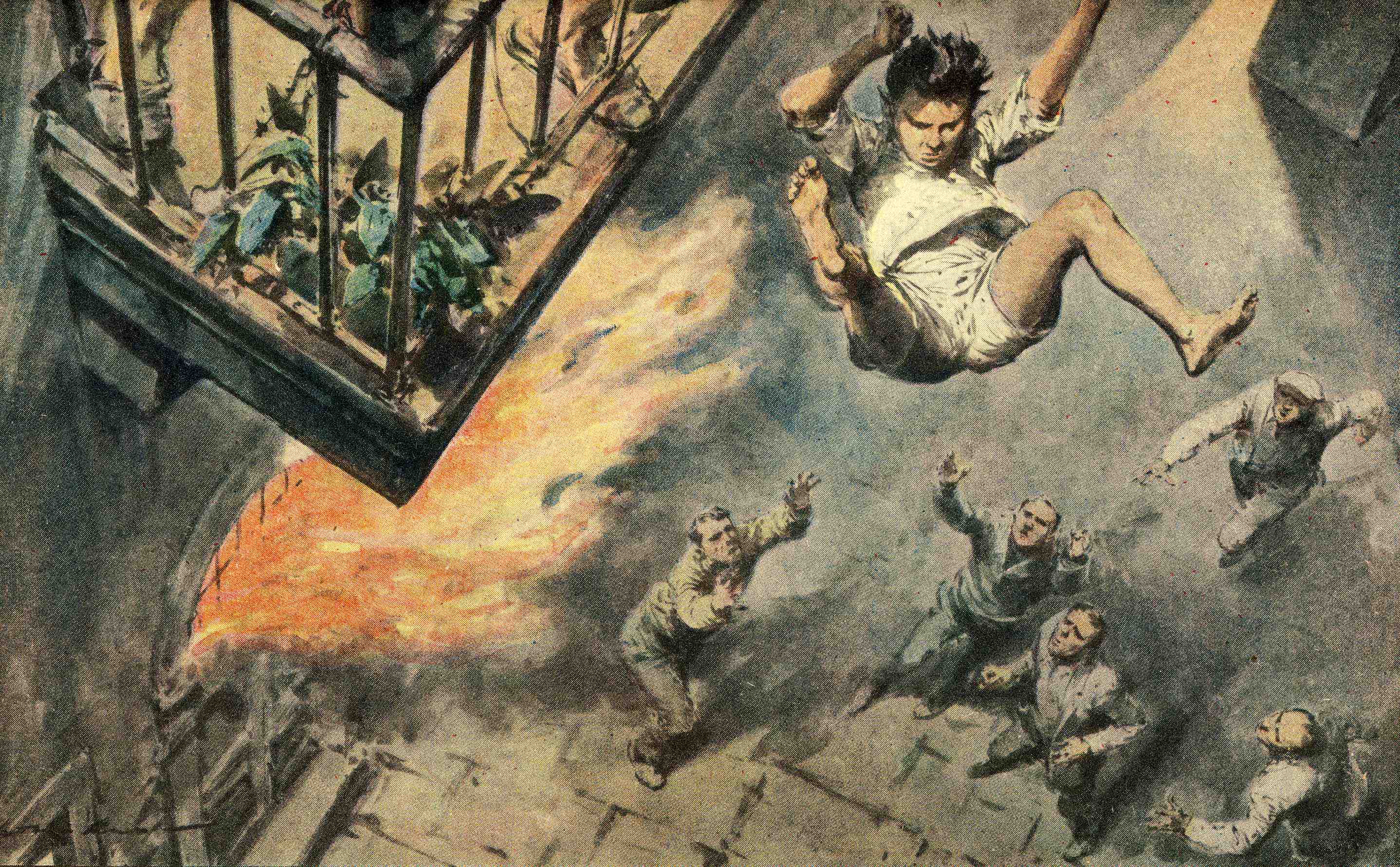
This final image is an exception and more in line with my teachings. The artist hangs the sympathetic character from the top of the page, and we feel the space below by anticipating the fall. Viewers read all pages from left to right and but from top to bottom, and in this case the read is designed to heighten drama. We travel with our eyes from the balconey in the top left, down to the recuers in the bottom right.

Finally, notice too, that there is more than one kind of perspective at work here. In addition to traditional perspective, Molino uses “atmospheric perspective,” too. The forground character (the boy) has darker and lighter tones than the rescuers below. That helps our brain to understand that the boy is closer to us (and not simply a giant), and that those below are further away (rather than tiny people). The atmosphere has that effect on our perception, and replicating it in a picture helps communicate distances clearly.

STORIE-autorimessa-dett-bimbo

Writing with Pictures: Poetic Advice

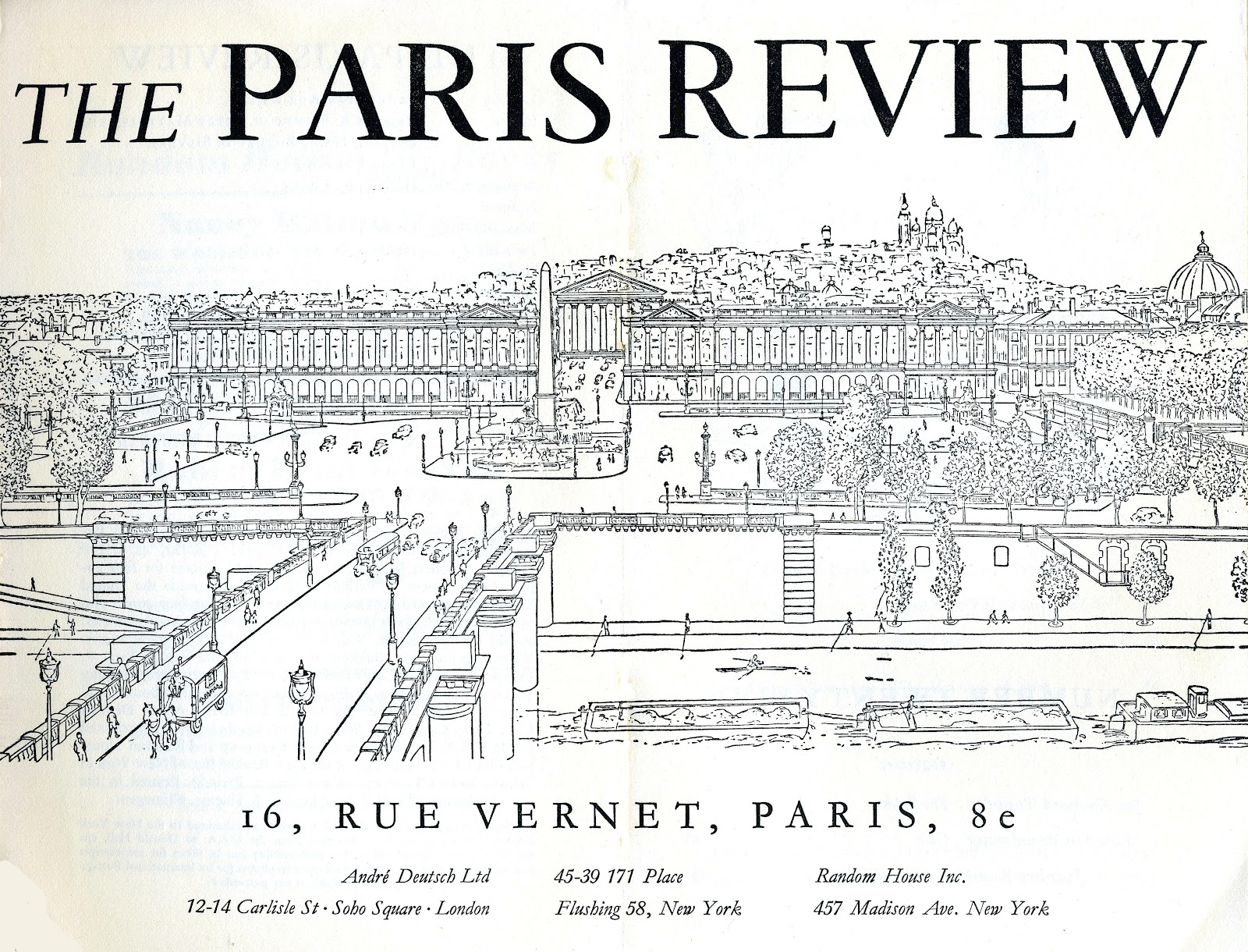
fl5imk6jbkrbtp6xrphc.jpg  The-Paris-Review217.jpg

Stanly Kunitz, in the August 1988 issue of The  Paris Review, described well the process of getting art from the head to the page. As a believer that illustration is “writing with pictures,” I often find advice from writers to be particularly use in my teaching and professional practice.

“The poem in the head is always perfect. Resistance starts when you try to convert it into language. Language itself is a kind of resistance to the pure flow of self. The solution is to become one’s language. You cannot write a poem until you hit upon its rhythm. That rhythm not only belongs to the subject matter, it belongs to your interior world, and the moment they hook up there’s a quantum leap of energy. You can ride on that rhythm, it will carry you somewhere strange. The next morning you look at the page and wonder how it all happened. You have to triumph over all your diurnal glibness and cheapness and defensiveness.”

Stanley Kunitz (1905-2006) won many awards for his writing including the National Book Award and the Pulitzer Pize. He was the U.S. Poet Laureate in 2000.

Book Look: Drawing on the Spot

cover.jpg

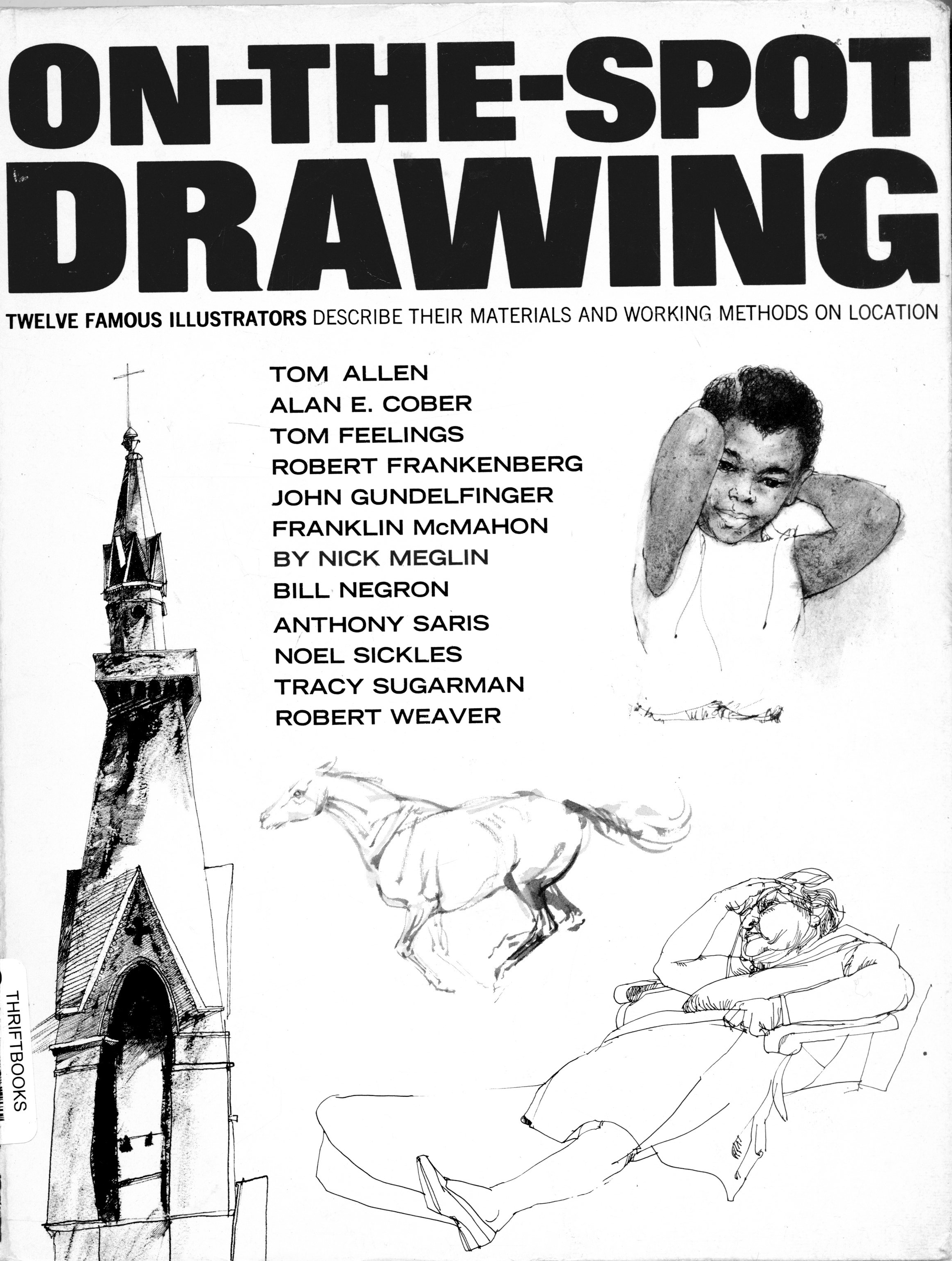
Drawing On the Spot: Twelve Illustrators Describe Their Materials and Working Methods on Location by  Nick Meglin was published in 1969, and that was a time when a number of prominent illustrators were regularly commissioned to do visual reportage for magazines. Looking at the list of artists interviewed in the book, we see some very important and influential artists. Back then, magazines like Fortune would feature lots of illustration – much of it created from on-site investigation and creation. Sports Illustrated was, well, illustrated, art least partially. And publications such as Holiday and Look which no longer exist, sent illustrators on assignment as correspondents as well. And they were not the only ones.

Nowadays, we’re seeing a resurgence of illustrators working on location, although the assignments are still quite slim. It’s interesting to see how many great young illustrators of reportage there are in England right now. But in the US, there are only a few who have a busy reportage practice.

What we do know is that the internet has fostered the huge growth in the popularity of sketching on location and charing the work online. Artists and designers are acting as correspondents of their own lives. Urban Sketchers (which I’m affiliated with) is approaching its 10th anniversary, and it has fanned the flames of enthusiasm.

So perhaps it’s a good time to revisit Drawing On the Spot. In the first of what I hope to be a series of book reports, I cull the book for some nuggets of wisdom from a number of artists who worked “outside the box” – their studios that is,  to  create great works as both artists and correspondents. What follows are highlights from the chapters on each artist and a reproduction of their work from the book or the internet.

Tom Allen

plate1_r1_c1.jpg  Tom Allen.jpg

“The only sacrosanct rule of art for me is personal involvement. All other rules can be – and have been- successfully broken. An artist must be intensely involved with his subject in order to give it his particular insights and convictions – his point of view.”

 “Without total involvement there would be no art, only pictures.”

 “There may be several aspects of a scene that stimulate my interest. Sometimes the stimulating factor is the mood, or an emotional response, or sometimes it’s the the activity in a scene. More often it’s the elements of design in a scene that stimulates me. I look for shapes and compositions formed either by things and people, or by light and dark.”


Alan Cobercober.jpg  483533-015.jpg   alan-cober-drawing-sitting-at-the-arch.jpg
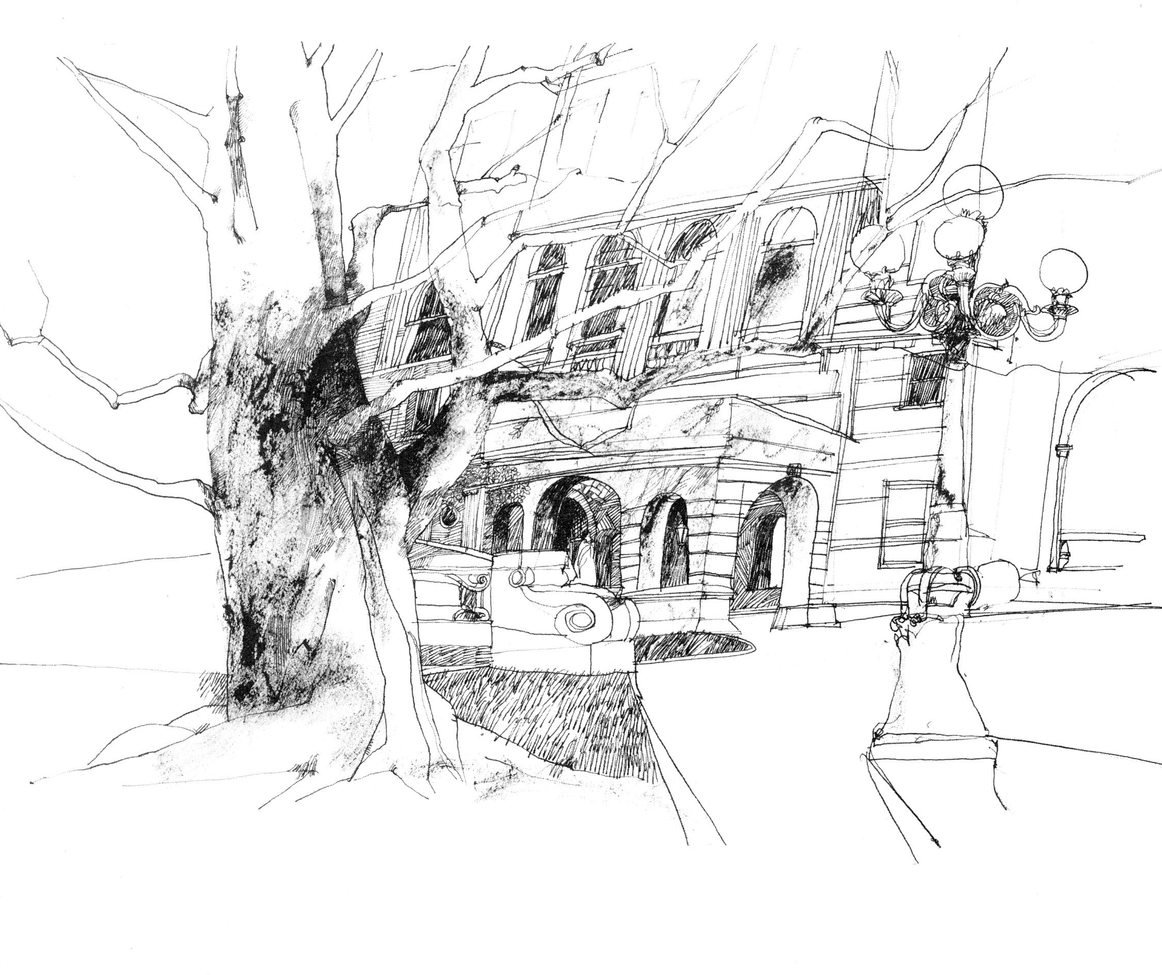
“A drawing should have a life of its own”


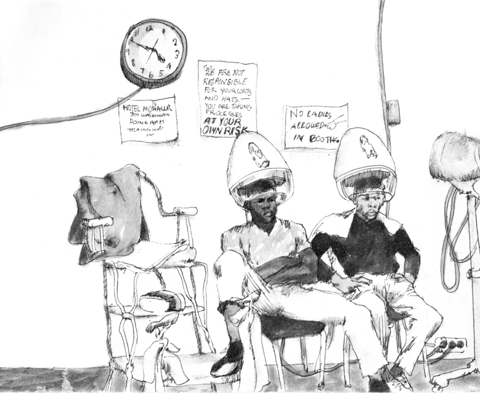
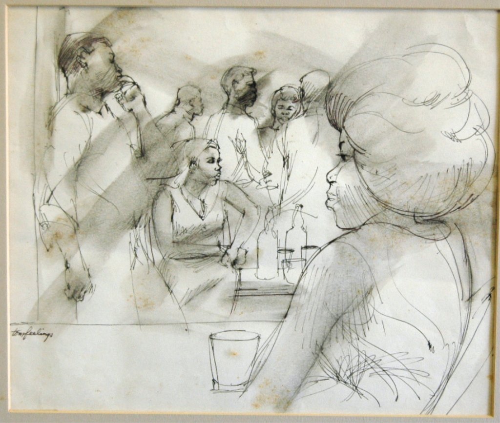
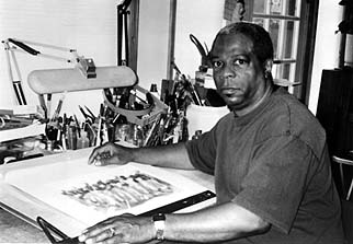
Tom Feelings

 tom feelings.jpg   15170620_2_x.jpg  tomfeelingsphoto.jpg

“For me, it’s not art for art’s sake, it’s art for my sake.”

 “It’s important for an artist to depict the things he feels strongly. Growing up in a black community in Brooklyn and yet not seeing enough drawings and paintings that say enough about the people and places right outside my door – the things I see and feel every day – convinced me of the need to portray this contemporary scene. I deeply feel that this direction is extremely important for the black artist, for his own development and search for originality.”

 “If you’ve never felt insignificant, you don’t have to search for your significance as I did. I returned to the United States (from working in Africa) with the need to express myself as a man through my art.”


Robert Frankenberg

frank....jpgfrankenberg.jpg

“There is a difference between looking and observing.” 


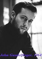
John Gundelfinger

00-1.jpg 0cb8264f2b2490ea14b0e5809fc39e85.jpg
Gundelfinger.jpg  28899_John_Andre_Gundelfinger_bio.jpg

“There’s no such thing as “interesting subject matter,” what’s interesting about any subject is what you as an artist do with it. There have been interesting drawings made of what might be described as uninteresting subject matter” just as there have been flops with subjects which beg to be drawn. The fault is not with the subject but with the artist.”

“Although I believe there’s a drawing everywhere, I don’t draw everything I see. I draw only that which moves or interests me at the time. The reasons for being stimulated perhaps can be explained psychologically later on, but it’s of little concern to me. I don’t question an inspirational moment; I succumb to it. THe more you observe and draw, the more possibilities arise even from areas that most would consider dull (consider Van Gogh’s chairs, for example). The point is to draw first and ask questions later, for if the process is reversed, they’ll be too much thinking and theorizing being done and not enough drawing.”

John Gundelfinger’s drawing seem like “natural,” as if the picture were there and all he had to do was in front of him. But this can never be the case. You have to see a picture first, and the seeing is done with an educated, sensitive eye, not a lucky one.

“I never know what a drawing will look like until it’s finished. Once you do – that’s security: and security is something we can all do without in drawing.  It comes from working in a particular way or style that enables you to control any subject or situation you encounter, and once you’re in control you stop learning. The nervousness and anxiety that precede a drawing are important to the end result, and certainly more of an asset to it than mannerism can ever me.

“I can learn more from my mistakes than from a drawing where everything fell into place easily.”

 “It would be of little use to try to copy or imitate a good line, shading technique, or composition. Repeating a past success is no real accomplishment.”

 “A finished on-the-spot drawing is a fortunate experience and should always be thought of as such. It shouldn’t be the reason you go out, for the objective is “drawing” and not “the drawing”.”

 “That old cliché that “art is 10% inspiration and 90% perspiration has, like most clichés, a solid foundation. There is just no substitute for hard work…”


Franklin McMahon
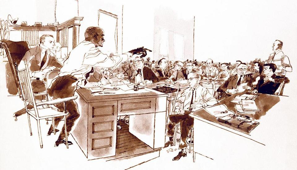
obitArtist.jpg
Ihobama2.jpg

“Most of my (reportage) work is self-assigned. I go out with an idea or premise, draw it, then submit the drawings and captions to publishers who might be interested in the story.”

On-the-spot drawing enables a type of picture coverage not ordinarily employed by photographic reportage. The cameras click “during” – seldom before or after the “decisive moment.”

“Too many artists are more concerned with the drawing process than what the drawing is all about. Materials take care of themselves if you use them simply as tools for carrying out your concepts. Once you start thinking about them you lose some of the intensity is a lot more important to the drawing than a trick line or shadow.”

McMahon isn’t searching as he draws, he’s stating.

“I don’t seek out the merely “picturesque” because everything has a way of paying off as you begin to set it down on paper.”

 “On-the-spot drawing allows you to take a kind of cubist approach to the subject to the subject, drawing it from several angles in the same drawing, and drawing it as you “know” it to be rather through someone else’s angle of vision or emotional point of view, which is why I prefer not to use (other’s) photographs.”

 “But most of all I believe the drawing, not just sketches or rough notations, but early commitment to the actual drawing, should take place on-the-spot. That gives artist, pencil, and subject a chance to interact.” 


Nick Meglin

meglin.jpg meg1.jpg   meg.jpg

“I try to draw laughing eyes, not hazel eyes; or if the subject is asleep, I try to draw sleep rather than closed lids. There is a difference, and my interest is in capturing that difference.”

“Many who distort do so because they have no alternative. Distortion, then, becomes a blanket to hide the artist’s inability to produce an honest, accurate study beneath.”

 “Good draftsmanship is not of an age or a “school’. It can never be dated. There always has been and will be, a place for it in the art world. What do become dated are thought processes and boundaries set up by tastes, opinions, styles, techniques, and the “acceptable” art of a particular era.”


Bill Negron

negron.jpg

Whatever “catches” him at that instant becomes the point of emphasis.

The name of the game is selectivity. Not an intellectual selectivity, but an emotional one that responds to the moment; it cannot be anticipated nor can the effect be predetermined.

“It doesn’t make much sense to draw everything the eye can see. The greatest advantage an artist has over the camera is the ability to pick and choose. He can include or omit things at will, accenting that thing over there or fading out that street light over here. This ability to pick and choose, when combined with similar features that a camera is capable of, such as taking in a scene with a wide-angle view or coming in on something with a telescopic view, gives the artist great latitude. He can bring into focus only that which interests him.”

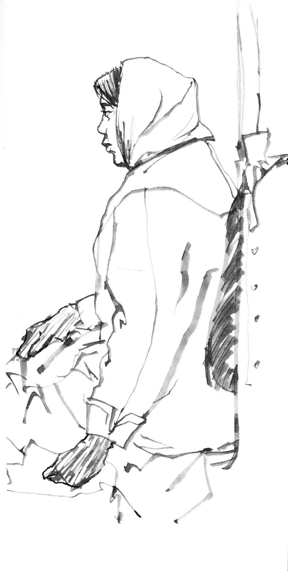
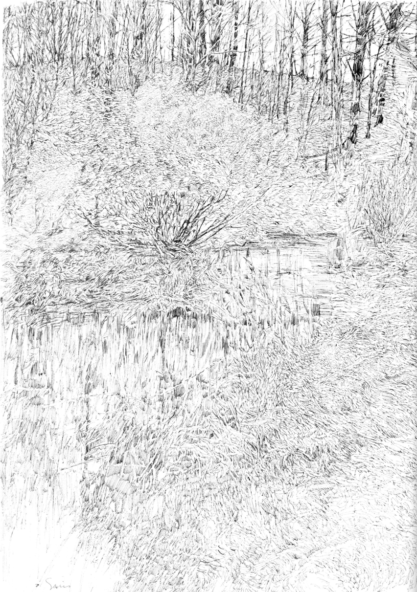
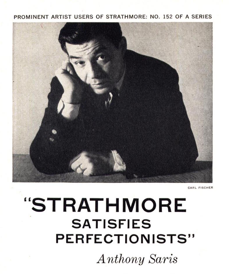
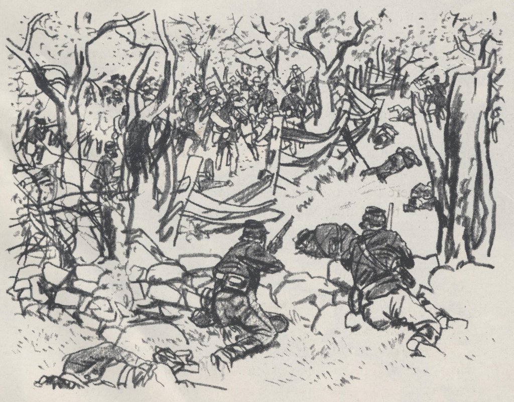
Anthony Saris

saris.jpg   4117709561_53a0e06b74_o.jpg
4117840414_6fe7ef3dff_o.jpg

“A sketch…is much more fragmentary than a drawing, It’s a preliminary notation, often serving no purpose other than that of jotting down an impression. The pages of an artist’s sketchbook make up a graphic diary of personal thoughts, ideas, and observations; each sketch is a study, a learning process, an unfinished experiment with no predetermined use.”

“When I sketch, I’m not concerned with making personal statements or with producing a finished piece of work. I’m free of constraint and of the external pressure of deadlines, research, etc., which of course, make work especially pleasurable and relaxing.” 

His motivation for drawing is far removed from his motivation for sketching, yet both are executed with the same sensitivity and with the same dedication to accuracy.

An important advantage of the objective approach is the learning which takes place.

“With on-the-spot drawing the artist encounters unpredictable situations. Once he becomes stimulated by what he sees, he’s forces to create what he feels despite his materials.”

Noel Sickles

Sickles2.jpg   Noel Sickles.jpg80277190_16d9cf955f_z.jpg    sickles081.jpg

 “They (reportorial and landscape artists) share a common goal – to tell the story. But hasn’t that always been the role of the artist? What is the objective of “objective art” if not to tell the story?”

“My approach to drawing has always been to communicate. That’s my chief concern. I will reduce things to basics or arrange them in a particular way, anything that will enable me to achieve the goal. An artist has the freedom to do this, his major advantage over the camera in the past and certainly in the present. Since I work rather representationally, I have to take into account all these factors. I enjoy the challenge of location drawing, and my responsibility to that challenge is to be there, on-the-spot, with all faculties alert. If the artists eyes are focused only through the camera lens he won’t be aware of what is taking place all around him, which is often of equal importance to that taking place directly in front of him.”

In the case of personal or scenic art, there are various approaches open to the preference or mood of the artist. In reportorial work, however, demands of factual representation and a high degree of identification present an altogether different list of essentials.

As Sickles puts it:
“For reportorial work, one needs a draftsman, an artist who goes beyond a literal rendering and who interprets and selects. He can often make the slightest sketch significant and can bring life, meaning, and vitality to a drawing as well as the imprint of a personal style. When I was asked to draw public figures at work in the NY State Senate in Albany, my sketches had to be just what was expected of me as an on-the-spot reporter – the Senate Hall had to look like the Senate Hall, and if a particular senator was up there on the dais addressing the assembly, then the drawings had damn well better show who that senator was. Any artist worth his salt doesn’t want to depend on a caption underneath to bail him out of a bad likeness.”

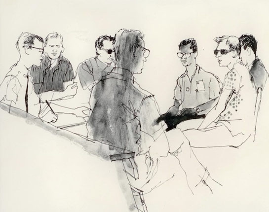
Tracy Sugarman
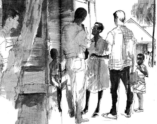
freedomsummer_galleryts_10.jpg  sugarman-author-photoszdjpg-cf7f75d81facd001.jpg
freedomsummer_galleryts_06.jpg  freedomsummer_galleryts_07.jpg

“To me, the most significant aspect of the on-the-spot drawing is the ability to get closer to man and the world he’s made.”

“You become more than an observer; you become part of the picture emotionally. You find yourself giving up assumptions, generalizations, and beliefs  once you’ve been exposed to real thing. It’s a learning process, one that never fails to alter preconceived ideas if you maintain an open mind.”

“Working in the studio may increase an artist’s knowledge of technique, but not of the world. When you’re on-the-spot, you meet people, you talk, you trade ideas and opinions. Hopefully, you grow. But most important you learn about yourself, sometimes more than you learn about your subject.”

“To me, bold committment is an emotional involvement with what you’re drawing rather than how you’re drawing it. You cannot be totally objective when you have the ability to pick and choose your subject. It stands to reason that a particular need from within precipitated your choice and your drawing is going to show it.”

“It is the emotional involvement that gives a drawing more significance than a photo of the same subject. Whether it registers in the viewer’s mind consciously or unconsciously doesn’t particularly matter – the result is the same. He’s aware that he is looking at an effort of someone with a special kind of talent who felt involved enough with what was happening to take the time and effort to record it in his own special way.”

“We’re also aware that in a minute’s time at least one photo can be taken. You needn’t have a thimble full of art knowledge to look at the average drawing and know that it could not have been executed in the same amount of time. This assumption can’t help but add to the significance that a drawing possesses.”

“To me the essence of successful reportage is capturing the fact and the meaning of a moment in time. For anyone who has found himself in the pressured position of struggling to fix that instant on paper when the situation is fugitive – sometimes hostile – it is an ideal only sometimes achieved. But it is in the attempt that I have found the joy of reportorial work.”

“If the moment is worth capturing, then the artist has the responsibility of endowing the drawing with the compassion that comes from understanding. It is in this fragile dimension the artist’s gift to the viewer is made.” 

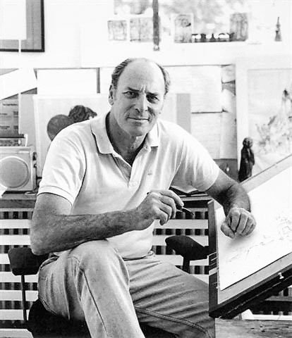
Robert Weaver

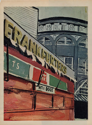
a893a43229e2969b1cdd9e21b0e76741.jpg  weaver-ebbetsm.jpg
weaver.jpg robert-weaver.png

“The journalistic approach in art is nothing more complicated than a I desire to tell a story, describe an event, or illustrate a mood. The illustrator has experienced something and he desires to reproduce it. Many painters simply don’t have this desire, but an illustrator who doesn’t have it cannot very well serve the course of journalism.”

Bob Weaver doesn’t set out to “do an illustration” per se, nor does he aspire to produce a timeless work of art. His goal is basically to report; his approach – journalistic, his method – visual notations.

What he also brings along is an extraordinary ability to see and record, and he does this with an integrity that is – if one had to choose – the single most important factor of Weaver’s work.

“I think it’s absolutely essential, so far as is humanly possible, to remove all biases and preconceptions before starting a journalist assignment. We need more good reporting, fewer editorial positions. It’s far more effective to show the villain clearly than to denounce him. I’m not talking about some moral imperative to be ‘fair,’ but what makes for the maximum impact.”

Out of context with the rest of the drawing, Weaver’s line is impatient, blunt, insensitive. it’s not the kind of line you admire for its intrinsic beauty – it has little. Weaver works for the sum total, the completed drawing; and that drawing is both sensitive and beautiful, and interesting contradiction pointing out the fact that a beautiful drawing isn’t necessarily made with beautiful lines.

“Any on-the-spot sketch would provide a welcome sparkle to the printed page – lighten it. There is no doubt there are too many photos cluttering up magazines and newspapers, e.g. the public figure with a lot of out-of-focus bric-a-brac behind his left ear, or the full color photo “essay” which is all design and no content.

A second advantage would be the element of immediacy and spontaneity – rapidly disappearing from the news photo. More and more, it seems to me, the photographer and the subject are in some kind of cahoots; that is, a public figure “performs” for the camera.

Which leads to the third and most important virtue of the sketch report, which has to do with candor and truth. I think that the manipulative techniques of advertising (which is sometimes indistinguishable from the editorial elements of the printed media), the ballyhooing and self-promotion that magazines are indulging in more and more, all tend to create a credibility gap. I believe, then, that the artist could restore to the journals a visual excitement, a more personal view of events, and, finally, a more honest one.”

“You can see the unfamiliar more clearly than the familiar.”

If only a few illustrations attain this (Weaver’s) level of artistry, it is the illustrator himself who is to blame, for his approach is more often to produce something pleasing or novel, or middle-of-the-roadish. He is often more involved in developing a style that an idea.

“ There are too few illustrators who have the skill to communicate anything except very simple ideas. Magazine illustration for me is too decorative, too superficial. The challenge to the illustrator is to use artforms to reveal, to convey the gravity of and to delve into the issues of this particular time in history.

Perhaps its the fault of art schools, but there does seem to be a confusion of roles which leads the young illustrator to think he’s expected to produce works of art which are incidentally reproduced in a magazine. Nothing is more boring than this attempt to marry off the story-telling obligations of illustration with the latest school of painting. First-rate writing is having something to say – and saying it clearly. Illustration is, or should be, visual language.”

Further ObservationNick Meglin was the author of a number of books, many that deal with his years at Mad Magazine where he was an editor. A particular favorite of mine however, was The Art of Humorous Illustration, which is perhaps the first illustration book I ever owned.

the-art-of-humorous-illustration.jpg

Considering Vignettes

This summer at the Urban Sketchers Symposium in Manchester, England, I’ll be teaching a workshop entitled, Hunting and Gathering: Sketching Vignettes and Lists, and I’m so anxious to get started, that thought I’d share one of the lessons to a wider audience.

In a nutshell, my workshop will address alternatives to the most common drawing approach of drawing to the edge of a page. 

When we work on site we select what we draw; we don’t draw everything before us. What choose to draw is a decision – a selection. By selection I mean the “cutting out entire” from the great panorama spread out before you just that portion which appeals to you and which you want to have appeal to your fellow men.” That’s how F. Hopkinson Smith described it in his “Outdoor Sketching” talks given in 1914 at the Art Institute of Chicago (which I recommend and can be found free online). The result of our carving out from whats before us often results in what’s called a “vignette.” We see vignettes all the time, and create them often. But I think we take them for granted. Talking about the shapes of images can seem very subjective. But success comes from intent – conscious design decisions.

drawing by Fred Lynch

vignette is an irregularly shaped image on a page – one that doesn’t extend to the edge of the paper. Vignettes isolate and focus attention on a particular subject that’s before us. The word dates back to the time of illuminated manuscripts, when it descibed the drawings in the margins. The word comes from the french word for vines. We still see vignettes in books and magazines all the time, but how do we learn to design them well? I say, think of them as letterforms. 

Although these English alphabet landscape prints from the 1800’s were not drawn from life, they are ideal for teaching what vignettes are. The same rules of design apply to on-site drawings, as seen in these works from my students. They are not literally letters, but the shapes of the drawings act like them.

drawing by Karen JY Sung
drawing by Jia Sung

So, when creating vignettes, follow these principles for their successful design.

Vignettes do not extend to the borders of the page.

Vignettes are irregularly shaped.

Vignettes use the white of the page (the negative space) as an important design factor.

Vignettes are designed to sit with stability and balance on the page.

Vignettes end on all sides in a definitive way, and don’t just fade away in every direction.

In other words, vignettes are like letterforms.

Carving out scenes into pleasing vignettes is one of the things we’ll do in my workshop in Manchester. Perhaps I’ll see you there.

Grayson Perry’s Seven Lessons of Creativity

“A poet’s hope: to be, like some valley cheese, local, but prized elsewhere.” -W.H. Auden


I love this quote because it speaks so well of all artists and their need to balance the personal and the public.

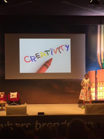
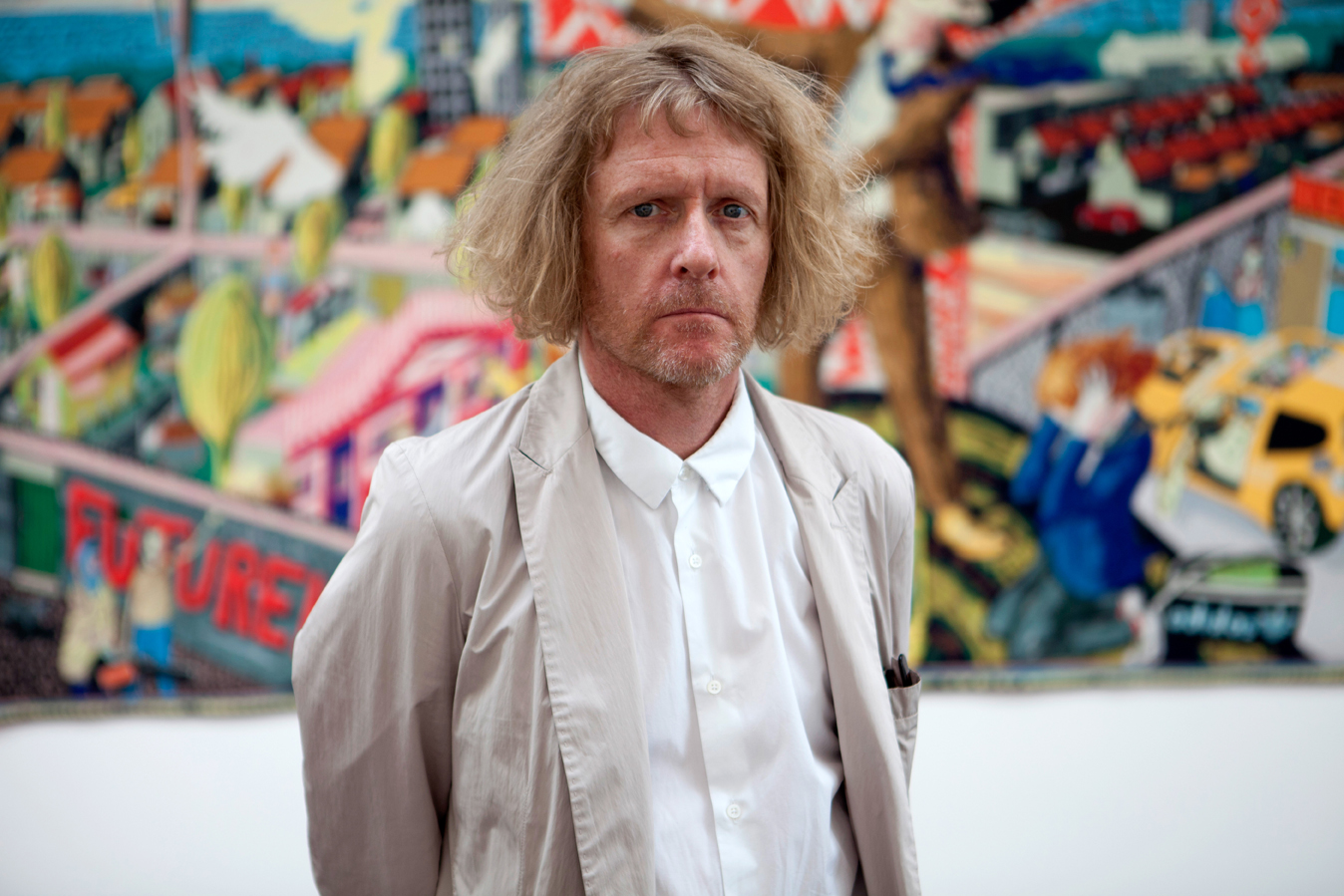
I love, too, where I found the quote – in a report on Grayson Perry’s talk last year at Advertising Week Europe. Perry, a Turner Prize-winning ceramics artist (and now Chancellor of the University of the Arts London), presented his seven lessons of creativity -in all of his transvestite glory. Perry’s given a number of these talks with slight variations, but they all make the same important points, and come from the same perspective.

grayson-perry-by-kirsten-holst.jpeg
Grayson Perry at University College London. Photo by Kerston Holst, 2013

Grayson Perry points out, “The word creativity has really gritted on me because it’s often used by people who aren’t, and say it’s very important.”

He’s not a fan of words like eclectic, authentic and profound. “If someone says they’ve got eclectic taste, I say they’ve got no taste.” As for passion, it’s too often spoken about by “men on stages with head-mics.”

CBBAPL8WsAATCU9.jpg-small.jpeg

Photo from Advertising Week Europe

Seven Lessons of Creativity


Know Yourself

“Whether it’s anger, sadness, adrenaline, sexual perversion, narcissism, addiction. You’ve got to own [your feelings] and use them,” he urged. “Don’t be scared about being too open, I’ve always thought. It’s never done me any harm.”

“I built a whole show around my teddy bear,” which Perry says acted as replacement father figure in his life after his own left at a young age.

Artists must take the terrifying road of “doing your own thing.”


Be Uncool

“Coolness is a form of orthodoxy. It’s a set of rules already coalesced around something. Being uncool is a powerful creative force.”

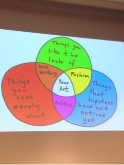
Don’t go along with the crowd, avoid the hipsters and don’t be afraid to make art that you think is beautiful, about what you’re interested in (in Grayson’s case headscarves and kinky sex) and where you live.

“As a transvestite I’m genetically impelled to be a bit uncool,” he said, showing a picture of himself as a 14 year old boy dressed as an “old lady.”


Play Seriously

“If you’re making art then you must make it seriously”

“You’ve got to take all of your little musings seriously. That little doodle in your sketch book might seem inconsequential but down the line it might turn into a major idea,” he said.

1307.perry.jpg

Be Specific (Not Global)

“In a global culture people shouldn’t be afraid to be specific. Look at what’s happened to youth culture. The internet has made youth culture across the world the same. it’s a mash-up of things. There’s nothing worse than attempting to be globally applicable.”

“A poet’s hope to be, like some valley cheese, local but prized elsewhere.” -WH Auden


Nobody is Original – Don’t Try

Perry said that according to the “Helsinki Bus Station” theory, an artist’s career is like picking a bus: the bus is your artistic style, and as you get off at each stop you meet different people who will compare your work to something which has gone before. So you go back to the bus station, and pick another bus. And repeat the process.

“You’re in a no win situation,” said Perry. “What you’ve got to do is stay in the fucking bus.”

“The creativity happens after 50 stops; you’ve just got to keep plugging someone else until you become original.”

CBBAfR7UwAEMxz-.jpg-small.jpeg

Put the Hours In

Get better at working all the time. Focus on the skill of making something, regardless of the meaning of the finished product.

“I learned about that by making model airplanes. I get obsessed with detail.”


Grrrrrrrr

Notice your reactions to the world, especially if they’re angry ones.

“I like using anger… anger puts me in a different place”


Further Observation

Grayson Perry’s Venn diagram for aspiring artists. (Fuzzy photo courtesy of an attendee.)

grayson2.png


More about Grayson Perry’s creativity talks here, here and here.

Tough Lessons

70a3d9bd46a59f5aa674899ae04f37e2

Art schools can be cruel places.

David McCullough’s book, “The Greater Journey” is a chronicle of decades of American artists, authors and scientists, seeking education and inspiration in Paris.  A master collector of terrific anecdotes, McCullough shares two stories that caught my eye,  as familiar tales of criticism faced, and tough lessons learned.

The_Greater_Journey_(David_McCullough_book)_cover

Tough Teacher

Of Samuel Morse’s painting lessons in London, under Washington Allston:

As a teacher, Allston was exceedingly demanding. His critiques could be “mortifying”, Morse wrote, “when I have painted all day, very hard and begin to be pleased with what I have done…to hear him after a long silence say, ‘Very bad, sir. That is not flesh, it is mud, sir. It is painted with brick dust and and clay!” ‘ At such moments, Morse felt like slashing the canvas with his palette knife. He felt angry and hurt, but with reflection came to see that Allston was no flatterer, but a friend, “and that really to improve I must see my faults.” 

John-Inman-Henry-Inman.jpg

Washington Allston,      self portrait


Tough Classmate

On George Healy’s first day studying at the atelier of Baron Antoine-Jean Gros:

In the world of the Paris atelier, rigorous hazing was an established tradition any newcomer, let alone an estanger.

Proficiency in drawing came first and foremost. Drawing was the foundation  of everything, it was preached, and most of every day was devoted to drawing a live model, the students packed at their easels elbow-to-elbow. Once, during an early session, while a model was taking a break and Healy concentrated on looking over his efforts, another student, short, rough-mannered, and older than the rest, suddenly stepped in and shoved him aside, saying “Donne-moi ta place, Petit” (“Give me your seat, Kid”).

“He coolly turned over my sheet of grey paper (Healy would remember) and sketched the model, who resting, had fallen into a far better attitude than which we had copied. The outline drawing was so strong, so full of life, so easily done, that I never had a better lesson.”

The rough-mannered student, Thomas Couture, was to become one of the celebrated French painters of the day, and as a teacher have great influence on many more Americans to follow. He and Healy became fast friends. 

87fceafd52001b133270b4eecd64eb08.jpg

drawing by Thomas Couture

Lessons: Be a Stove, Not a Refrigerator 

Words of wisdom, which I’ll use often, as a mantra for my students, my classroom, my school and for myself – from an article about professional photographers who use Instagram as a vehicle for artistic exploration: Be a Stove, Not a Refrigerator. Cook up new things, don’t just preserve old ones.

“…even within the parameters of a style, (Gueorgui) Pinkhassov’s images are charged with a perpetual element of surprise – he says he’d rather be a “stove” than a “refrigerator,” would rather cook than keep. The effect of seeing a new picture by him, as you scroll down the instagram feed, is often a jolt of wonder and gratitude.”

– On Photography, “Instagram – Free, Chaotic and Immediate – Has Become a Place to Watch Great Photographers Work Out Their Obsessions” by Taju Cole, New York Times Magazine, 12/13/15

Lessons: “Ask Not What Your Country Can Do For You…”

11150469_10153170626389757_8864168508949709982_n

Not long ago, Montserrat College of Art (where I teach) hosted the illustrator and designer, Oren Sherman as a guest artist. He lectured inspiringly and then visited classes including mine: Senior Illustration Thesis. It was there that Oren shared a terrific life lesson – that his professional career changed when he “stopped asking for things and started offering things” as a strategy for success. He urged the Montserrat seniors to do the same.

13381_1083338015016457_5315417954029622764_n

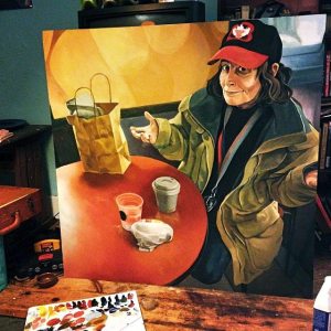
Dunkin Donuts painting by Amberlynn Narvie

As an example, he spoke of my student, Amberlynn Narvie’s terrific paintings of the “regulars” at the local Dunkin’ Donuts, where she worked for years. “That’s a great story” he said. “Call the editor of the local paper and start from there.”
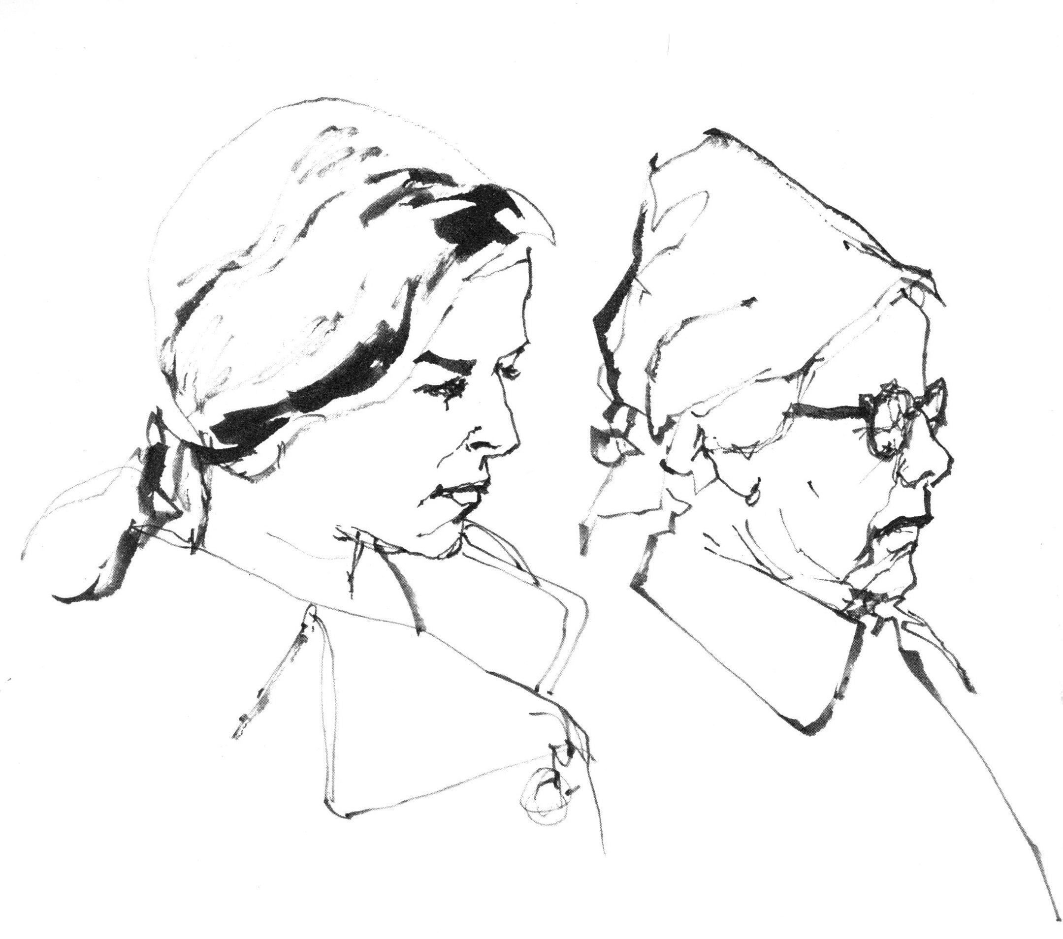
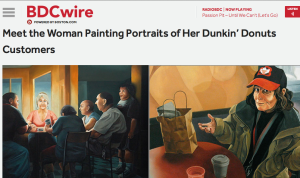
She acted on his urging and did even better. She put the work on Reddit and was immediately contacted by both Boston.com (the Boston Globe) and Metro Boston.

Now she’s been interviewed by both papers, and so, her career begins.

Screen Shot 2015-04-13 at 8.33.18 PMScreen Shot 2015-04-22 at 8.29.09 PMScreen Shot 2015-04-22 at 8.30.13 PM